Digg.com is Back: The Reboot We Didn’t Know We Needed
Digg, the iconic social and link-sharing platform that once held the title of “the homepage of the internet,” is making a triumphant return — and this

Ready to jump into some amazing new design ideas for Spring? Our roundup has everything from UX to color trends covered.
Let’s spring into some fun colors and unique UX. This month’s roundup of website design trends should have you feeling fresh and ready to head into the new season.
Here’s what’s trending in design this month:
There are many fun little elements appearing in new design projects. With emerging technology and users with faster, more reliable internet everywhere, it’s much easier to incorporate some of these fun elements and know that they will work.
To get the most out of each of these examples, click through and play around a bit. Also, be on the lookout for similar unicorns as you navigate other websites.
Double 2 does a few different things, but the most fun element in the design is the color picker at the top right of the screen. Print designers might recognize some of the crop and bleed marks as well as the CMYK color block. Click a color, and the background changes to match; the logo also takes on a new font treatment and style with each shift.
Akaru does one thing like the example before it, with downpage navigation – is this an emerging trend of its own? – but shines with the treatment of the right side, numbered panels. Click any of them to jump into a web experience for that section of the site that all seems to happen without you leaving. The menu has a nice feel as well, with robust menu options, hover state animations and a full reel video.
Your Majesty is a magazine-style website with a homepage design that seems to bend images and space. Click on any of the images and you pop into an immersive content experience with the same shape-bending background for each. The design leaves every user with a quandary – do I want to read on or just keep looking at all the great art effects?
Black-and-white imagery has such a classic feel that it is often hard to think of as a trend. On the other hand, the use of black-and-white images and video seems to come and go in waves of popularity. Right now, it’s returning to prominence.
The secret to using black-and-white imagery is connecting it to storytelling. The lack of color has to work in concert with your brand and design story to be truly effective. Otherwise, it can leave users somewhat underwhelmed or confused.
In each of these examples, the use of black and white has a purpose, and each website design tackles it in a different way with a different purpose and results in mind.
Michelle Benzer showcases her work by leading off with a beautiful black-and-white video reel that leads into color images. The stark nature of the black-and-white video helps bring focus to the color images when they appear. It’s a classic example of contrast for impact done well.
Luciano de Crescenzo also uses a black-and-white concept for his personal site, leading off with two images of himself taken decades apart. While the design does feature some color well below the scroll, the images grab your attention with the simple overall aesthetic. Between the black-and-white photos and light-and-black design, everything is created to facilitate reading.
The Boathouse isn’t a personal portfolio but does highlight the work of a brand agency. This design features a collage with plenty of black-and-white images that animate onto the screen as an attention-grabber. The placement and style of text in the hero area with the colorless images give the design an elegant feel.
All three of these designs start in black and white and transition into some additional color on the scroll. This is done with purpose. Too much black-and-white imagery can feel stark and lifeless, while flipping from black-and-white to color has a type of “Wizard of Oz” effect, bringing life to the design.
If you thought bright colors were gone, you are wrong. They are back!
The colors that made Material Design palettes popular – yes, pink and purple among them – are making a return to all types of website design projects. (And we kind of love them.)
There’s something fresh and happy about bright colors that’s hard to ignore. They work well for everything from portfolio sites to app landing pages. The only real challenge with this color trend is the potential to create a not-so-great combination of hues because of your brand colors. (So be careful there.)
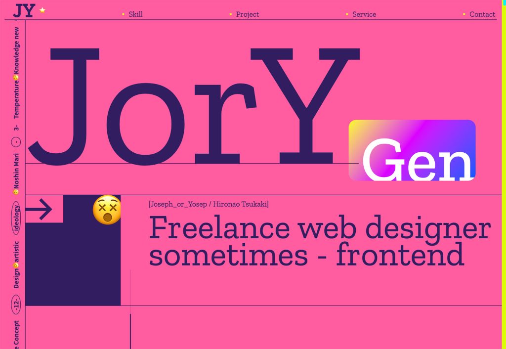
Joseph Yosep uses a fun combination of color and oversized text to get attention. Subtle motion doesn’t hurt, either.
Function and Form uses a more neutral background color and goes all in with bright graphics. Multiple animated screens introduce different elements, many of which feature similar color palettes.
Say Social combines color and interesting animation – look for the UX unicorn in the navigation wheel downpage – in a way that makes you want to click around. The design uses multiple variations on color themes with tints and tones that make everything work seamlessly with a variety of two-color, bright options.
While user experience changes aren’t for the faint of heart, they can have a huge impact on your overall design and projects. For most website revamps, this isn’t something we’d recommend, but these ideas are great to think about when planning new projects.
The same can be said for both of the color trends featured here. Using black-and-white imagery is a distinct choice, as is a super bright color palette at the other end of the spectrum.
We hope these ideas inspire you to try something new with some of your upcoming website design projects.
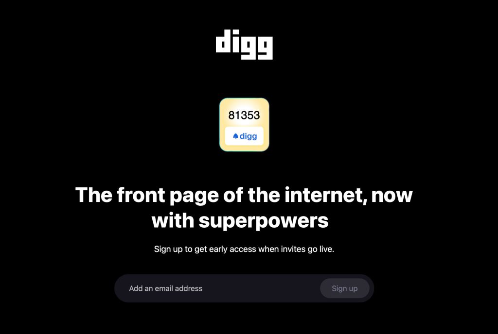
Digg, the iconic social and link-sharing platform that once held the title of “the homepage of the internet,” is making a triumphant return — and this
How do designers use their own websites to promote themselves online? What are some good ways to set up an online presence that gets you found, puts y

It sort of feels like our lives are nothing more than an endless string of decision-making, doesn’t it? You go to the grocery store and half an aisle
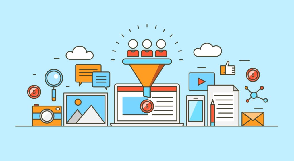
It’s nearly 2020, and every eCommerce brand should be using key metrics to pinpoint advertising, boost sales and improve fulfillment.Emma Miller, Seni
There are so many distractions when you are a freelancer. From kids coming into your home office or time sucks like Facebook, you need to focus and be

Tracking content performance is the key to a successful campaign, but you can’t do that unless you know which metrics to track.How do you measure whet
We are a dynamic information platform dedicated to delivering timely, relevant, and reliable content across a broad spectrum of topics. From the latest in technology and business to lifestyle, health, and global affairs, we aim to keep our readers informed and inspired.
Our editorial team is committed to maintaining high standards of accuracy and clarity, ensuring that every article provides value and context in an ever-changing world. We believe in the importance of accessible knowledge and strive to make complex topics understandable for everyone.
Whether you're here to stay updated on current events, explore thought-provoking features, or simply learn something new, our goal is to offer a trustworthy source of information that meets the needs of a diverse and curious audience.