Who Owns the Web Now? Centralization vs. Decentralization in the Age of AI
The web is going through a slow-motion identity crisis.It began as a decentralized playground of pages, links, and raw human curiosity. Then came the


Let’s be honest: double-clicking is dead. And if it isn’t, it should be.
What began as a clever way to differentiate between selection and activation in the ‘80s desktop environment has somehow clung to life support through decades of UX evolution. But in 2025? It’s nothing short of a usability fossil.
We don’t double-tap apps on phones. We don’t double-click buttons on the web. We swipe, tap, long-press, voice-command, and gesture — but double-click? That’s a mouse-flavored ghost of the past.
To understand why the double-click has persisted for so long, you have to go back to the beginning. In the early days of graphical user interfaces, the mouse was still a novelty. You had one button (two if you were lucky), a clunky CRT, and no clear way to distinguish between “highlight this” and “open this.”
Enter the double-click — a clever workaround for a limited input system. It made sense. Back then.
But today’s interaction environments are light-years ahead: mobile touchscreens, mixed input modes, AI-driven predictions, haptic feedback, accessibility-first design. Yet somehow, double-clicking still lurks in file explorers, buried in OS defaults, and — shamefully — in some legacy web apps.
Let’s talk mobile, the UX bootcamp of the modern age. On smartphones, every interaction counts. There’s no room for redundancy, no tolerance for confusion. You either tap, swipe, or press. Anything more nuanced? It’s out. There’s a reason iOS and Android designers never even considered porting over the double-click.
Why? Because it’s unintuitive. It creates micro-failures — users miss the timing, do it too fast or too slow, and the system doesn’t respond. On mobile, that would be catastrophic. On desktop, it’s just annoying.
Defenders of the double-click will argue it’s faster. You can select and launch with a quick flick of the finger. But speed only matters if the gesture is reliable, and double-clicks are notoriously fickle. OS settings vary, click speeds differ by user, and the feature is often misfired by novices.
This is particularly dangerous for accessibility. Older users and those with motor impairments often struggle to consistently double-click within the OS-defined time window. That’s not just bad UX — that’s exclusionary design.
Because OS vendors won’t let go. Windows still defaults to double-clicking to open files. Mac users still habitually do it, even though a single click often suffices in modern Finder. And enterprise environments? Forget it — they’re a museum of interaction decay.
Double-clicking remains because it’s the path of least resistance for engineers, not for users. It’s deeply embedded in system logic, file explorers, and legacy mental models. But it’s not here because it’s the right choice. It’s here because no one’s had the guts to kill it.
Thankfully, web UX designers quietly buried double-clicking years ago. Try double-clicking a button on any modern web app — it won’t do anything different. You might get a word selected, at best.
Progressive web design relies on clarity and speed. The fewer interaction steps, the better. Taps and clicks are minimized, not duplicated. A good interface anticipates intent; it doesn’t require you to prove it twice.
And with the rise of gesture-based interfaces, voice commands, and AI assistance, there’s simply no cognitive space left for old-school “click twice to confirm” mechanics.
AI-driven UX is the bulldozer flattening the remnants of double-click logic. Predictive input, contextual menus, and smart defaults eliminate the need for redundant gestures.
You want to open a file? AI can infer that when you hover, or glance, or even whisper its name. You want to select something vs. activate it? The UI should adapt — not force you to memorize interaction rules from 1984.
Double-clicking is fundamentally anti-AI. It says “I don’t trust the interface to understand what I mean unless I hammer it twice.”
We already have the answers:
If you’re designing a desktop or web experience in 2025 that relies on double-click, you’re not being nostalgic — you’re being lazy.
Design is not about preserving ritual. It’s about eliminating friction.
The double-click is not a shortcut. It’s a UX tax. A holdover from a time when our tools were dumb and our UIs were dumber. If you’re building experiences for today’s users, stop asking them to click twice when once is enough.
Like pop-ups, infinite dropdown menus, and “Are you sure you want to delete this?” confirmations, the double-click is a red flag. It doesn’t add clarity — it creates dependency. It doesn’t respect user intent — it forces learned behavior.
Good UI communicates. Great UI anticipates. Obsolete UI demands obedience.
Double-clicking? That’s the last one. Let it die.

The web is going through a slow-motion identity crisis.It began as a decentralized playground of pages, links, and raw human curiosity. Then came the

I recently witnessed a startup website train wreck. It was an extreme failure because the owner launched too soon and the consequences of doing so wer
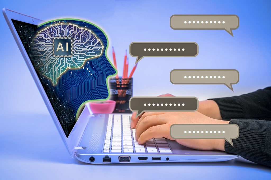
Being a web designer in 2025 feels like wearing five hats at once: strategist, psychologist, trend forecaster, accessibility advocate, and occasional

Ahoy Mateys! You’ve probably noticed lately that your website is looking a little worse for wear. What she needs is a bit more than fair skies and win

When it comes to technology, faster isn’t always better.It’s true that 47 percent of people want web pages to load in two seconds or less (and 40 perc

Alright, it’s time for some tough love: breadcrumbs are dead.And before anyone accuses me of disregarding 20+ years of usability studies and web desig
We are a dynamic information platform dedicated to delivering timely, relevant, and reliable content across a broad spectrum of topics. From the latest in technology and business to lifestyle, health, and global affairs, we aim to keep our readers informed and inspired.
Our editorial team is committed to maintaining high standards of accuracy and clarity, ensuring that every article provides value and context in an ever-changing world. We believe in the importance of accessible knowledge and strive to make complex topics understandable for everyone.
Whether you're here to stay updated on current events, explore thought-provoking features, or simply learn something new, our goal is to offer a trustworthy source of information that meets the needs of a diverse and curious audience.