AI Changes Everything and Nothing
However, most sweeping technological change overpromises and under delivers, the responsibility for which lies with overly enthusiastic marketing depa

Acquiring a new customer is difficult, but retaining an existing one is even more challenging. Yet, statistics show that efforts focused on retention bring way more value.
For instance, according to SmallBizGenius, 82% of companies agree that customer retention is cheaper than acquisition. Apart from that, 65% of a company’s revenue comes from existing clients, and increasing the investment in retention by only 5% already gives you a boost in profits by 25% to 95%. Impressive, right?
So what should you do to reach such results?
One component that impacts brand-client relationships is website design. This article will give you three design tricks that will encourage your customers to come back to your site more and more.
It is hard to imagine a website visitor who would spend more than five minutes (usually it’s way less) trying to figure out the navigation system on your website. If you have a loaded, complex site structure, you will not retain a customer.
Take Craigslist, for instance. Its navigation is not user-friendly, not to mention that it took over 30 seconds to load when the acceptable average load time should be no more than 1.7 seconds:
Here’s what proper website navigation presupposes:
Since we mentioned Craigslist, let’s take a look at its competitor AdPost, which has a better website structure:
Instead of listing all the product categories on the front page, like Craigslist, AdPost added them to the search menu, thus making the design more user-friendly and making the navigation cleaner.
If you have visitors coming to your website from around the world, you should not assume they know English. A survey by Weglot found some interesting results regarding the attitude of buyers to shopping on international websites:
So, there is no doubt that having your website localized to several languages can increase customer retention, especially considering the last stat.
To understand the proper practices of making a website multilingual, look at the examples of the best language learning apps. For instance, Preply has a drop-down menu where you can choose from multiple language options, including Polish, Ukrainian, German, and many more:
Translating your website to different languages will help the visitor understand the value of your product better. However, before you invest in localization, make sure you study the data on customer behaviors to understand which languages your audience speaks.
Some companies don’t bother much with designing their websites, especially when it comes to custom elements, such as visuals. However, research has shown that the focus on branding in website design increases customer commitment and e-loyalty, as a result.
Moreover, in the world of billions of websites, you need something that would help your business stand out. And custom illustrations are among those features that contribute to your site’s uniqueness.
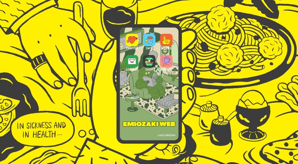
Just take a quick look at the Emiozaki Web site. It includes personalized illustrations and animation created in the form of a tablet that substitutes the navigation menu:
This website reflects the brand’s tone and style, and animation adds emotion to UX. Apart from that, it’s also an excellent example of structuring a website.
Or, if you would like an example of a less loaded design, take a look at this personal portfolio by Victoire Douy. It also includes animations that add interactivity to the design. For instance, you can play with the shadow of the girl’s hand:
So, if you want your website to attract more customers and encourage them to hang out for longer, take the creative approach. Hiring an illustrator is, of course, costly, but it will help your site stand out.
As you can see, you’ll have to put in a lot of work to bring forward website design that increases online customer retention. You just have to employ our three best practices. Let’s quickly recap them:

However, most sweeping technological change overpromises and under delivers, the responsibility for which lies with overly enthusiastic marketing depa
It offered a simpler and cleaner design direction for websites and interfaces. Web and app designs became less complex in terms of styling, speeding u
In user experience, friction is anything that prevents users from accomplishing their goals. Friction is a major problem because it leads to bouncing,

This article will explain how to create a fantastic business proposal that looks great and gets signed quickly. Although we’re focussed on design, our
In this month’s collection we’ve got some really beautiful examples of what can be done with a few images, a couple of great fonts, a handful of color
Spring into action this season with new tools to boost your workflows, facilitate creative thinking, and help you be a more efficient designer. This r
We are a dynamic information platform dedicated to delivering timely, relevant, and reliable content across a broad spectrum of topics. From the latest in technology and business to lifestyle, health, and global affairs, we aim to keep our readers informed and inspired.
Our editorial team is committed to maintaining high standards of accuracy and clarity, ensuring that every article provides value and context in an ever-changing world. We believe in the importance of accessible knowledge and strive to make complex topics understandable for everyone.
Whether you're here to stay updated on current events, explore thought-provoking features, or simply learn something new, our goal is to offer a trustworthy source of information that meets the needs of a diverse and curious audience.