Poll: Is Basecamp Right To Shutdown Politics At Work?
In a post that has been revised for “clarification,” the company’s co-founder Jason Fried listed six rules for employees: No societal or political dis

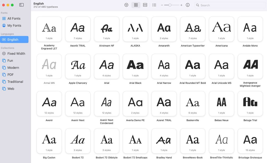
Remember system fonts? Good old Times New Roman, trusty Arial, and the unkillable Courier New. Fonts so baked into operating systems, they felt like infrastructure—like sidewalks and salt.
For a solid decade, they were the default visual language of the web. Now? They’re fallback options. A footnote. The web’s equivalent of hold music.
And let’s be honest: most of us aren’t mourning the loss.
But maybe we should.
There was a time when designing a website meant choosing between a half-dozen system fonts and praying they rendered correctly on Internet Explorer 6. Georgia was the edgy choice. Verdana was the safe bet. Web typography wasn’t about taste—it was about survival. And in that landscape, system fonts were gods.
Fast forward to 2025. How many websites still choose to use system fonts as their primary typeface? Outside of performance-first apps or minimalist indie blogs, the answer is practically zero. Not because they’re bad fonts (they’re not), but because we’ve moved on. Because now we can.
Let’s pause and give credit where it’s due. System fonts gave the web its earliest identity. They were familiar, reliable, and light on the bandwidth. They were typography’s version of comfort food. But like all nostalgia, that warm feeling turns tepid when faced with actual usage.
System fonts are often cited in performance discussions—“Look how fast this page loads! No font files! It’s just system fonts!” Yeah. And it looks like a tax form.
You can call it nostalgic. Users call it unstyled.
Typography is 95% of web design. Let that sit. Most of what we interact with online is type, not color, not layout, not animation—text. So when we settle for a fallback font, we’re saying, “Eh, close enough.”
That’s not UX, that’s apathy.
System fonts, for all their historic charm, lack character. They weren’t designed for branding or storytelling. They were designed for legibility across wildly different operating systems. Great for email clients. Not so great for expressing tone.
It’s no coincidence that when Apple rolled out San Francisco, or Google pushed Roboto, they weren’t just refreshing UI—they were branding their ecosystems. Typography is experience. Why are we still pretending it’s optional?
Yes, custom fonts are heavier. Yes, you might get a flash of unstyled text (FOIT/FOUT party, anyone?). But let’s be real: modern web performance isn’t being bottlenecked by font files. It’s being smothered by 9MB of JavaScript tracking scripts, four chat widgets, and a heatmap running in the background.
If your page loads in 4 seconds, it’s not because you used Roboto.
Font files are tiny compared to the visual and emotional payoff they deliver. System fonts may be fast, but they don’t feel fast. And on the modern web, perception is reality.
Here’s the hot take: using system fonts today is almost never a design decision. It’s a placeholder. It’s the equivalent of lorem ipsum. A silent admission that typography was the last thing on the list—or worse, an afterthought.
And that’s fine, if you’re prototyping or bootstrapping. But in production? In 2025? That’s like launching a luxury car with plastic seats and saying, “It gets you there.”
Designers: your typography is the voice of your product. If you let the OS choose your typeface, you’re letting Microsoft or Apple or Linux speak for you. Is that the brand you want?
Ironically, system fonts have quietly evolved. San Francisco, Segoe UI, and the newer versions of Noto and Ubuntu fonts are beautifully crafted, readable, and responsive to screen contexts. They have weights, ligatures, and OpenType features that make print designers weep.
But here’s the rub: they’re no longer shared. San Francisco doesn’t ship with Windows. Segoe doesn’t show up on iOS. The promise of system-wide fonts has splintered. So when people say “use the system font stack,” what they really mean is, “Hope it doesn’t look weird on Firefox on Linux.”
We’ve outgrown the idea of a shared typographic baseline. The global web has no system font anymore. Just a blurry fallback chain.
System fonts are fine as insurance. Every font stack needs a parachute. But should we be designing our experiences around the parachute?
Let’s not confuse reliability with quality. Yes, Arial will render. But Arial is a lie. It’s Helvetica’s less-attractive cousin who only shows up at family reunions to borrow money. We shouldn’t be building sites around fonts that exist solely to be “good enough.”
Web typography should be opinionated. Purposeful. Specific. The moment we default to system fonts, we’re handing the keys to someone else’s aesthetic. And for what? A 10ms performance gain?
We’re living in the golden age of web typography. Variable fonts let us modulate everything from weight to width on the fly. Font loading strategies are smarter than ever. You can license a single typeface that behaves like a family. We have access to expressive, accessible, and even animated typography—all without leaving the browser.
Why are we still clinging to Arial like it’s 2003?
It’s time to stop treating typography like plumbing and start treating it like voice, mood, and tone. Because that’s what it is. And no, your system font stack won’t cut it anymore—not for brands, not for apps, and not for experiences that want to be remembered.
Use system fonts when it makes sense—when you’re building admin dashboards, performance-critical apps, or UI kits that need neutral, flexible defaults.
But don’t pretend it’s a statement.
If you care about voice, tone, and trust, use a real typeface. One that fits the story you’re trying to tell. The death of system fonts isn’t a tragedy. It’s progress.
System fonts aren’t villains. But they’re not heroes either. They’re the background extras of the web: quiet, forgettable, and replaceable.
And that’s exactly where they belong.

In a post that has been revised for “clarification,” the company’s co-founder Jason Fried listed six rules for employees: No societal or political dis
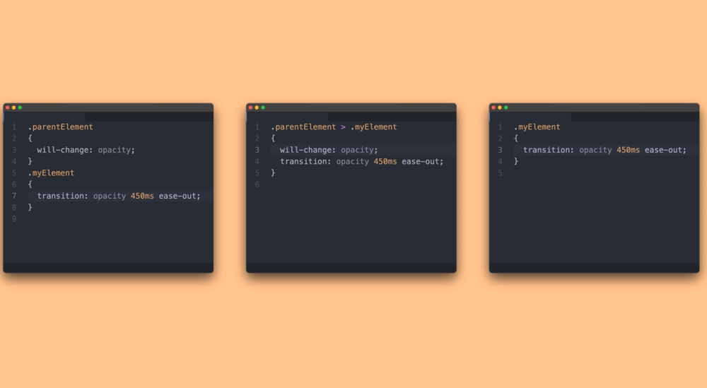
Writing fast CSS is about knowing your CSS selectors, knowing your shorthand, and understanding how properties are best applied. What better way to sp

No matter how well-designed your user interface may be, at some point or another, people using it are going to have to wait for something to load.The
In the fast-paced, technical world of web development, it’s easy to forget the human stories that lie behind the technology we use every day.Recently,
Somehow, we’ve come to accept the notion that digital technology is the answer to all of life’s problems. That conclusion has resulted in more and mor

Looking for a new way to experience Instagram and get something more out of it? If you are, then Instagram Stories is just the kind of update that you
We are a dynamic information platform dedicated to delivering timely, relevant, and reliable content across a broad spectrum of topics. From the latest in technology and business to lifestyle, health, and global affairs, we aim to keep our readers informed and inspired.
Our editorial team is committed to maintaining high standards of accuracy and clarity, ensuring that every article provides value and context in an ever-changing world. We believe in the importance of accessible knowledge and strive to make complex topics understandable for everyone.
Whether you're here to stay updated on current events, explore thought-provoking features, or simply learn something new, our goal is to offer a trustworthy source of information that meets the needs of a diverse and curious audience.