AI Agents for Designers, Developers, and UX Strategists: What You Need to Know Now
Let’s talk about something that’s been bubbling under the surface of tech conversations lately: AI agents.Now, I know—just reading the phrase “AI agen

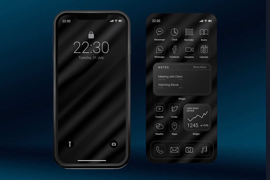
Somewhere along the way, dark mode stopped being a thoughtful accessibility option and became a design religion. In fact our obsession with dark mode might be UX poison disguised as user preference.
A few years ago, it was a nifty little toggle buried in your app’s settings menu. Now? It’s the default in half the web’s trendy products, a marketing bullet point, and—let’s be honest—the tech world’s equivalent of slapping a distressed font on your coffee shop chalkboard to signal you’re “cool.”
But here’s the problem: dark mode might be doing more harm than good—not just for users’ eyes, but for your product’s UX. And like Comic Sans in the late 90s, it’s being pushed far beyond the niche it was meant to serve.
One of dark mode’s most persistent selling points is the claim that it’s easier on the eyes. And yes—in certain contexts (low light, AMOLED screens, specific eye conditions), that’s true. But the blanket statement that “dark mode reduces eye strain” is about as scientifically airtight as “Comic Sans improves literacy.”
In fact, light text on dark backgrounds can actually increase visual fatigue for long-form reading. Your pupils dilate to take in the darker background, which reduces depth of field and makes text edges blurrier. That’s why reading a novel in dark mode often feels like staring into a foggy fish tank.
If you’ve ever found yourself switching back to light mode halfway through an article, you’ve already experienced this. The irony? Designers keep implementing it because it’s “user friendly,” without considering that most users’ eyeballs don’t care about your aesthetic moodboard.
Here’s the kicker: dark mode was originally about accessibility—helping users with photophobia, certain migraines, or vision impairments. It wasn’t meant to be a blanket style statement.
Now, we’ve flipped the script. Products launch only in dark mode because “it looks cooler,” which is like building a wheelchair ramp and then forcing everyone to use it, even if they can take the stairs faster and more comfortably. The people who actually need dark mode end up with a UX cluttered by designers trying to make it “vibe.”
And don’t even get me started on the “midnight navy” backgrounds that look sleek in your Figma file but test like garbage for contrast accessibility.
Let’s be real: dark mode sells because it looks like the future. Your landing page instantly feels more premium. Screenshots in the App Store pop. That deep charcoal backdrop says “we care about design” in a way white backgrounds never will.
The problem? The aesthetic halo blinds us to practical flaws:
It’s the same trap Comic Sans fell into. It was fun, different, and charming—until we saw it slapped on every PowerPoint, funeral program, and dentist’s sign. Overuse turns novelty into noise.
Here’s where it gets dangerous: the option to choose between light and dark has, in many products, been replaced by a design decree. There’s a growing crop of apps and websites that ship only with dark mode.
This isn’t innovation—it’s design monoculture. And monocultures are fragile. They ignore edge cases, alienate segments of your audience, and remove the very flexibility that made the feature appealing in the first place.
When we force a visual style in the name of “progress,” we stop designing for humans and start designing for Dribbble likes.
If you’re a designer or PM reading this, here’s your reality check:
Otherwise, you’re not offering an accessibility feature. You’re just chasing a trend.
The worship of dark mode is starting to feel eerily familiar. Like Comic Sans, it began with good intentions, offered genuine value in the right contexts, and then spiraled into overuse and misuse.
The real problem isn’t dark mode itself—it’s our tendency to treat design trends like religion. Once a feature gets an aura of “this is the right way to design,” we stop questioning it. We stop testing. And worst of all, we stop listening to the users whose needs don’t align with the aesthetic du jour.
Dark mode isn’t the villain. Neither was Comic Sans. But when you make a tool into a default, you’re not designing for the user—you’re designing for yourself. And that’s the first step toward UX poison.

Let’s talk about something that’s been bubbling under the surface of tech conversations lately: AI agents.Now, I know—just reading the phrase “AI agen

Pinterest has unveiled its much-awaited 2025 trend forecast, offering a sneak peek into the creative directions set to define design, lifestyle, and b

Of course, figuring out the right way to incorporate user-generated content into your site or blog can be a real challenge. It has to be done in a way
Ok, so you’ve built an awesome digital product—it might be a customer-facing app, an enterprise software, a web app or whatever. You’ve launched and,

Every human being needs, rather desperately, to feel accepted. They don’t necessarily need to feel accepted by everyone, but they do need to feel acce

As designers, we’re all guilty of it at some point…You’ve found that one perfect layout, that one stunning design that speaks to you—and before you kn
We are a dynamic information platform dedicated to delivering timely, relevant, and reliable content across a broad spectrum of topics. From the latest in technology and business to lifestyle, health, and global affairs, we aim to keep our readers informed and inspired.
Our editorial team is committed to maintaining high standards of accuracy and clarity, ensuring that every article provides value and context in an ever-changing world. We believe in the importance of accessible knowledge and strive to make complex topics understandable for everyone.
Whether you're here to stay updated on current events, explore thought-provoking features, or simply learn something new, our goal is to offer a trustworthy source of information that meets the needs of a diverse and curious audience.