The ultimate guide to design meetings
The basic idea of a meeting is simple: it’s when two or more people get together to discuss one or multiple topics. It can be in a formal or informal

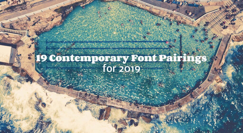
There are thousands of different styles available, so the task of finding the correct one to suit your project can often appear very difficult.
There are numerous tools online that offer assistance in selecting the correct font pairings. Here’s one we built ourselves. Using this handy font combination tool we have compiled a list of 19 contemporary font pairings for 2019. All of these fonts can be downloaded for free from Google Fonts.
This would have to be our top font combination for 2019. With it’s more traditional style, Playfair Display is both elegant and unique; it was designed by Claus Eggers Sorense, and can be paired with a variety of simple fonts, however, we think that Source Sans Pro is a perfect match, its thin lines and simple text make it a perfect combination for the more stylish Playfair Display.
Mount Barker By Callum Jackson
A very versatile font, Merriweather can be adjusted both width and height, which always makes for a popular style. A sans-serif font, like Oswald, with its simple lines, assists in highlighting the detailed serif of Merriweather.
Remarkable Rocks by Ben Goode
Streamlined, simple fonts are always top of the list, because they work well in just about any design style. Montserrat was designed by Julieta Ulanovsky, and can be highlighted with a serif font such as Merriweather.
Uraidla By Ben Goode
A stylish font that gives a modern twist, Raleway, can be complimented with another sans-serif font, like Lato. It has thin, simple lines and does not detract away from the more interesting shapes of Raleway.
Dolphin Beach by Ben Goode
A lovely feminine font, originally designed to celebrate the world of women. Elsie, is an adorable font style, with its gentle serifs and flowing lettering. With such an interesting font, a subtle font needs to be paired with it, like for example Roboto, because it doesn’t detract from the seed font.
Two Hands Wines by South Australian Tourism Commission
A very memorable font that creates a feeling of movement and intrigue, Dancing Script should be paired with a sans-serif font like Josefin Sans. This font is also very elegant and it’s very thin lettering brings the perfect balance between the two font styles.
Pennington Bay By Isaac Forman
What a fabulous font style, Abril Fatface, has combined the use of serifs with beautiful simplicity. It’s bold and ambitious and really jumps out of the page, because it’s such a wow font, a very subtle light weight font is best paired with it.
Bunyeroo Valley By Ben Goode
There’s something about this font that makes me think of bubbles and happy days. The unique use of rounded serifs, really makes this font different from others. A simple, slim font, like Nobile, makes the detail of Corben even more fascinating.
Wilpena Pound Resort – Old Wilpena Station By Tourism Australia
This style of font lends itself to being used for a storybook or some fairytale movie, and was designed by Branda Gallo. It creates such interesting aspects with its unique swirls, that turn this otherwise simple font into one of mystery and complexity. It is beautifully paired with Open Sans, because it’s very simple.
Vivonne Bay By Raphael Alu
Designed by Alejandro Inler, Wendy One, is a very bold, fun font style, that gives a youthful feeling. A bold font such as this should be paired with something thin and streamlined like Lato.
Flinders Ranges By Jake Wundersitz
Round and thick, Baloo was designed by Ek Type, and is a versatile font style, because it can be used in many different font weights and heights. Such a bold font like this, should be paired with a very simple style like Montserrat.
Grazing Land near Baroota Reservoir By Isaac Forman/Serio
Happy times and good memories, Cherry Cream Soda makes you feel like you’ve stepped back in time to the 1950’s. It was designed by Font Diner, and is a fun and creative font. Due to its interesting design, it should be paired with a gentle font style, like Josefin Sans, as its subtle lines compliment the bold, unique text.
Para Wirra By Ben Goode
A font of many surprises, at first glance you think it’s a simple font, but take another look and you realize the slight curves that make this font something different. It can be used for many different design styles, because of its versatility in weight and size, and is best paired with a font like Open Sans.
Kati Thanda-Lake Eyre National Park – Wrightsair Scenic Flight by South Australian Tourism Commission
A gentle, and extremely usable font, Palanquin was designed by Pria Ravichandran, and can be used in many different design styles. It looks amazing bold or thin, and has many different options for pairing fonts, however we think that Roboto is perfect, because it too is a very simple font.
Steingarten, Rowland Flat by Olivia Reynolds
Created by Omnibus-Type, this font remind me of summer days and eating mexican food. With its twist on the serif it creates such an interesting font style, that needs a light weight, gentle font to compliment it, like Open Sans.
The Lane Vineyard
Designed by Kimberly Geswein, a beautiful handwritten font, inspired by the writing style of a high school student. Waiting for the Sunrise, would be a perfect choice for a fun, youthful website, and can be used with another handwritten font like Rock Salt.
Cape Willoughby Lighthouse by Ben Goode
Designed by Valibhav Singh, this font is one of excitement and intrigue. The features of Eczar are designed to intensify as it increases in weight. With all the details of this font, it should be paired with a gentle sans-serif font like Work Sans.
Skye Lookout By Callum Jackson
A stylish, simple font that can be used in many different weights and sizes. The slight angles on the stems of the letters, create a unique, interesting feature to this font. It should be paired with a thin font, like Montserrat.
Dolphin Beach by Ben Goode
Based on the styles of the Art Deco era, this font is sure to create interest, with its unique lines within the type.
Due to its interesting features, it should be complemented with a simple sans-serif font like Open Sans.
Mount Lofty Botanic Garden By Jonty Paterson
Featured image via Unsplash

The basic idea of a meeting is simple: it’s when two or more people get together to discuss one or multiple topics. It can be in a formal or informal

I recently received a call from a young designer who I met when she was in art school. I reviewed her portfolio and several years later at a local gra
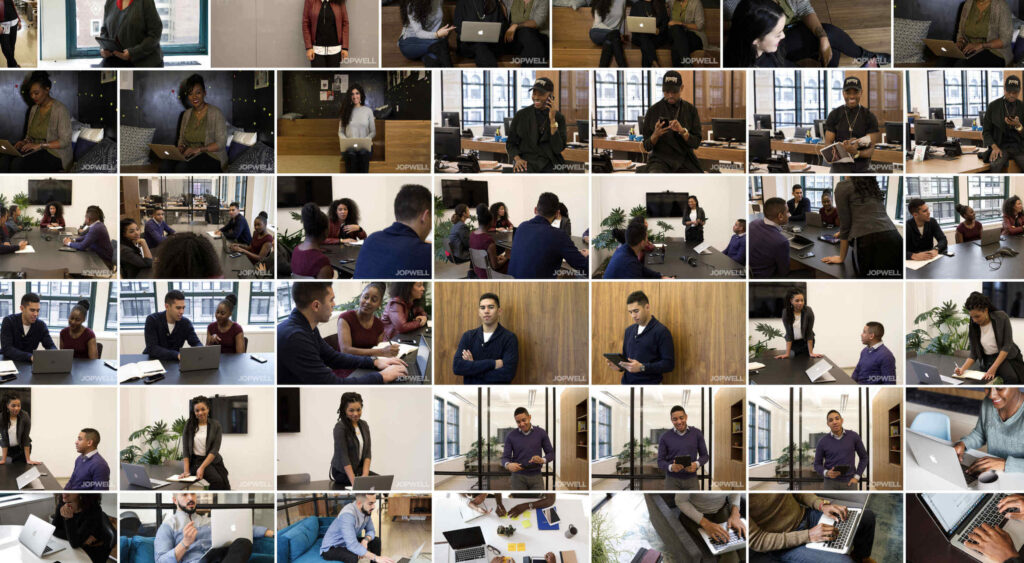
But let’s be honest: it’s not always easy to find photos that feel inclusive — whether they come from stock photo websites or your clients.Today, I’m
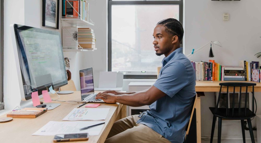
Navigating the world of web design can be difficult. There is so much conflicting and outdated advice.How many times have you been advised to obey the
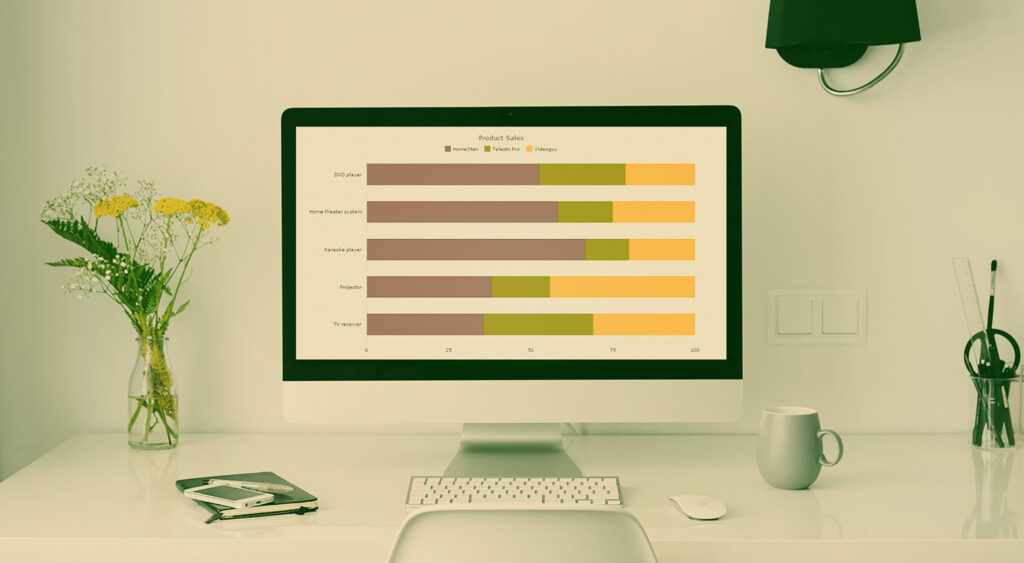
Data is all around us, and its visualization has already become an essential part of our lives. Charts, infographics, maps, and dashboards are in grea
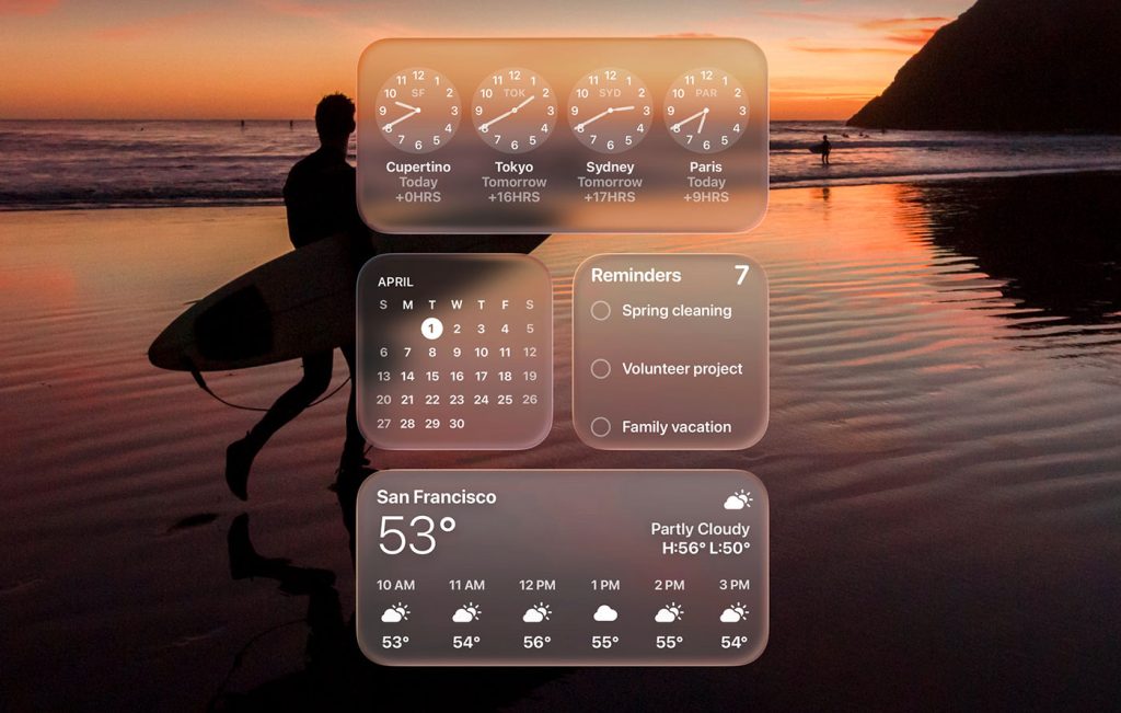
By now, everyone’s talking about Liquid Glass, Apple’s new design language unveiled at WWDC 2025.At first glance, it looks like another glossy facelif
We are a dynamic information platform dedicated to delivering timely, relevant, and reliable content across a broad spectrum of topics. From the latest in technology and business to lifestyle, health, and global affairs, we aim to keep our readers informed and inspired.
Our editorial team is committed to maintaining high standards of accuracy and clarity, ensuring that every article provides value and context in an ever-changing world. We believe in the importance of accessible knowledge and strive to make complex topics understandable for everyone.
Whether you're here to stay updated on current events, explore thought-provoking features, or simply learn something new, our goal is to offer a trustworthy source of information that meets the needs of a diverse and curious audience.