Why Zero Experience Designers Need A Chance
Moving from studying design into the big wide world of web design is a daunting process. It’s a competitive and dynamic industry that’s growing all th

A user experience is something that every website offers to those who visit it. However, the experience will differ from website to website in a wide variety of ways. Some are easy to navigate, some are a joy to use, some are clunky but you can still plod your way to where you want to go, and some are so difficult to understand that you just hit the back arrow on your browser.
One of the biggest influences on user experience is the user interface—the actual design that users will interact with—there are several factors that make up an interface, such as how easy it is to navigate through a website or how easy it is to read content. Users will also form their opinions based on the website’s perceived value and usefulness. The better it helps them accomplish their goals, the more useful it will be perceived to be.
The emotions that users feel while using your website, will end up having an impact on the associated business. If users can easily find what they are looking for on the website and feel satisfied, they are more likely to purchase from it, meanwhile, if they feel frustrated or confused, it is quite likely they will move along and purchase from someone else that offers them a better user experience. Lackluster user experiences hold many businesses back from their full potential, leaving their websites underperforming, and wasting valuable advertising dollars when visitors are not converted into customers.
Below are 5 simple, but potent, ways in which clever user interface design promotes successful user experience:
The page load speed of your website is an extremely important element of user experience. While designers often get caught up in trying to show off their visual design skills, the truth of the matter is that website visitors generally care more about page load speed than gaudy adornments.
According to a recent study by Kissmetrics, nearly half (47%) of all consumers expect a web page to load in 2 seconds or less; if your page takes longer than that to load, it is reducing the quality of the user experience. If your page takes more than three seconds to load, you will have, on average, 40% of visitors abandon your website; that will increase by 7% for each additional second it takes your website to load. A slow website translates into lost opportunities and lost sales.
Additionally, while slow load times cut down on the number of conversions your website generates, slow load times also work to reduce the number of opportunities your website will give rise to by having a negative impact on its search engine ranking. The effect is small, but you certainly want to do everything you can to improve your website’s search engine ranking.
To help keep your pages loading in under 3 seconds, try utilizing the following tips: first, opt for a simpler design style avoiding unnecessary items and flashy decorations (in A/B tests, simpler designs generally outperform ornate designs anyway); second, optimize your images in a graphics program, you don’t want to use html to resize them; third, avoid using too many plugins, they slow down the experience for site visitors; fourth, if your site is popular, consider utilizing a content delivery network to improve server response time.
White space is often overlooked but it is a very important part of effective user interface design. I am sure you have been in the same situation as most designers where clients view white space as empty space and rush to fill it, thinking white space is a waste. In fact, the opposite is the case; white space is one of the most important parts of a website.
If used properly, white space can dramatically improve the user experience of a website. White space helps make a user interface easy on the eye, which helps retain visitors and keeps them reading. It does this by making content more legible. The white space around website text and images helps people improve comprehension and creates a better user experience.
White space also helps improve the appearance of your website, giving it a nice, clean professional look. White space helps reduce confusion on the part of visitors as websites lacking in white space often look disorganized. You want to create a nice balanced look for your website using white space to separate different blocks of content.
White space is also effective to highlight something important such as your call to action. The proper use of white space in your design helps guide your visitors’ attention to key parts of your website and without it, visitors may overlook important items.
A wonderful example of this is the Chanel website. It is a beautiful, clean site that uses white space well to draw your attention to key areas of the site.
Website visitors will generally just skim your web pages looking for important keywords, significant headings, and scannable lists. Visitors are typically in a hurry to find the information they’re looking for and will skip over content that appears to be inconvenient or irrelevant. Because of this, you should understand that visitors will most likely not read your content if it is not formatted to this pattern of behavior. Avoid creating long blocks of text that appear uninviting to users wanting to quickly scan your website. When it comes to the modern web, less is definitely more.
You also want to avoid over-indulging in promotional writing, as customers will quickly see through fluff and stop reading. Having the correct tone is important. According to the Nielsen Norman Group, objective copywriting in a concise, scannable style results in 124% better usability.
When and where it is possible, utilize visuals as people tend to be better engaged by visual content. Utilize icons, attention grabbing images, video clips and infographics to help get your message across rather than relying on large blocks of text.
Bellroy illustrates this concept well on their website as they keep text down to a minimum amount and showcase their products with big, easy to view images.
Treat your website visitors’ attention as a precious resource. As visitors arrive at your website, remember that they will be quickly scanning for pertinent information and not paying full attention to everything on the page. If you clutter up your user interface, it will overload website visitors with too much information, make your website seem complicated and reduce the quality of the user experience.
Start by removing items that are not essential. By getting rid of anything that isn’t necessary to the user completing their intended actions, you will reduce the clutter and improve visitors’ ability to focus on and comprehend essential information.
ETQ’s website shows how by eliminating clutter you are able to focus on the products themselves.
You should have a clear goal for visitors who arrive at your website. You want this to be obvious to visitors and easy for them to complete. Perhaps you want visitors to make a purchase, request a quote, or just to call you, let them know what to do to keep them moving forward after landing on your website.
Your call to action is how you tell visitors what action they should take while on your website. We regularly see websites with no clear call to action and it is no surprise when we find out they are not performing the way their owners’ hope. Your call to action should stand out and make it easy for the visitors to take the desired action.
Before deciding on your website’s call to action it is best to understand your visitors’ reasons for coming to your website. Having a call to action that runs counter to visitors’ intentions will reduce its effectiveness. If visitors just want to make a purchase but you push them to ask for a quote it can cut down on the effectiveness of your call to action.
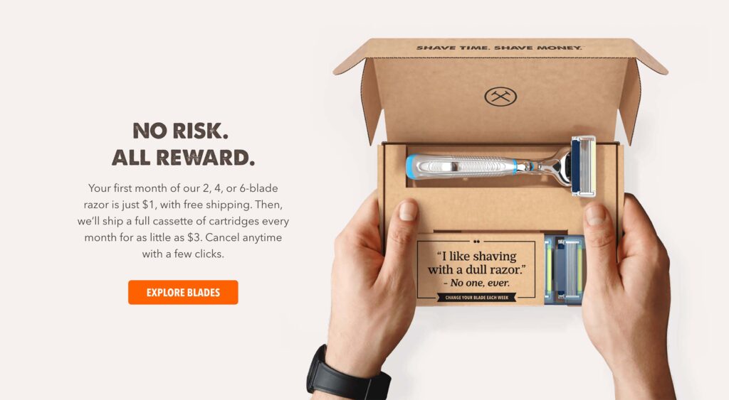
Dollar Shave Club’s buttons just beg to be pushed. Their website illustrates how clear calls to action can draw your attention and promote forward movement.

Moving from studying design into the big wide world of web design is a daunting process. It’s a competitive and dynamic industry that’s growing all th

When it comes to tech, Google has been synonymous with innovation, success, and world domination (hello, Android and Chrome!).But even the mightiest g

Let’s get one uncomfortable truth out of the way: web design is no longer about aesthetics, usability, or even user experience. Those noble goals have
In the fast-paced, technical world of web development, it’s easy to forget the human stories that lie behind the technology we use every day.Recently,

If you’re a designer, you’ve probably felt it by now: the creeping, soul-crushing pressure of platforms like Fiverr, Upwork, and the rest of the gig e
There was a time when “performance” lived in the dev team’s backlog, buried somewhere between “optimize bundle size” and “minify JavaScript.” Designer
We are a dynamic information platform dedicated to delivering timely, relevant, and reliable content across a broad spectrum of topics. From the latest in technology and business to lifestyle, health, and global affairs, we aim to keep our readers informed and inspired.
Our editorial team is committed to maintaining high standards of accuracy and clarity, ensuring that every article provides value and context in an ever-changing world. We believe in the importance of accessible knowledge and strive to make complex topics understandable for everyone.
Whether you're here to stay updated on current events, explore thought-provoking features, or simply learn something new, our goal is to offer a trustworthy source of information that meets the needs of a diverse and curious audience.