Pantone Unveils Color of the Year: Mocha Mousse
Pantone has unveiled its Color of the Year for 2025: Mocha Mousse (PANTONE 17-1230), a warm, soft brown that exudes comfort and sophistication.This se

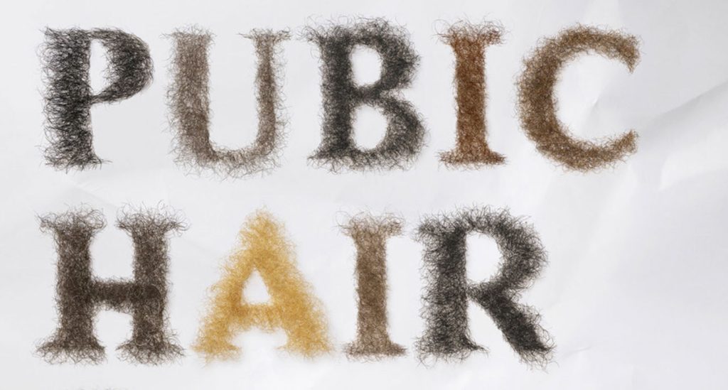
Hold onto your designer glasses, because Kiehl’s has just dropped the font equivalent of a mic drop—introducing… “Pubic Display Type.”
Yes, you read that right. This bold new font is here to take body positivity to the next level by literally putting “the body” front and center, with a name that screams (or perhaps whispers?) what the world has been missing: a font that unapologetically celebrates all the bits we usually avoid talking about.
Kiehl’s has taken a hairy situation and turned it into a bold statement with a new font that’s making waves—and maybe a few eyebrows raise.
After their 2024 intimate care ad featuring visible pubic hair got censored, the skincare brand decided to get cheeky with their response: introducing the “Pubic Display Type” font, made from real human pubic hair.
Kiehl’s introduced the three new visuals featuring headlines formed entirely from pubic hair:
In a world where the natural human body still faces censorship, Kiehl’s is having none of it. The new font is part of their campaign to challenge the beauty standards that make us squirm at something as simple as body hair.
Jon Sáenz, Kiehl’s Global Brand President, said it best:
“Our response to the censorship of our Kiehl’s Personals imagery underscores our commitment to honest conversations about body hair, and our private parts, and challenging outdated societal taboos. Pubic hair is a natural part of the human body, and there is no reason to feel uncomfortable with it. We believe in providing solutions for all skincare needs, without exception.”
With this hairy new addition, Kiehl’s is clearly here to encourage a little less waxing and a lot more honesty. They’ve turned a censorship fail into a full-blown statement—and we can’t help but somehow admire their courage… and creativity??
It’s like if Helvetica went on a rebellious spree, decided to loosen up a bit, and stopped worrying about fitting in.
Who knew that all we needed to truly embrace body positivity was a font? Apparently, it was right under our noses the whole time. “Pubic Display Type” is here to redefine beauty standards by taking the taboo out of body talk.
The rounded, playful letterforms are clearly designed to make you rethink what you’ve been taught about self-love and, uh, the human form.
So next time you’re designing a skincare ad or, let’s face it, a ransom note, why not throw in a little body positivity while you’re at it?
So What’s Next? Font-Based Body Liberation? Honestly, we don’t know. Maybe the next big thing will be “Pectoral Serif” or “Bellybutton Bold.”
Kiehl’s is clearly on a roll, and honestly, we’re here for it!
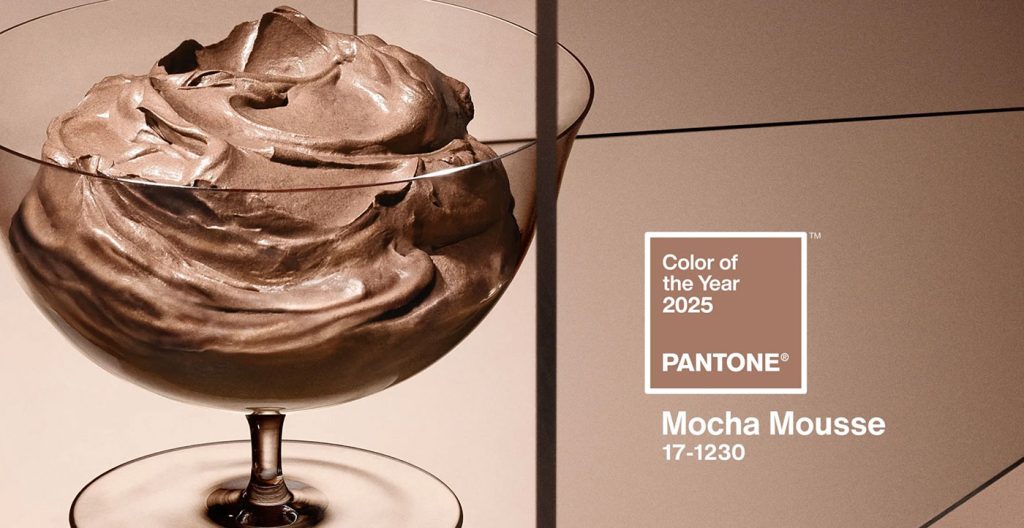
Pantone has unveiled its Color of the Year for 2025: Mocha Mousse (PANTONE 17-1230), a warm, soft brown that exudes comfort and sophistication.This se

The majority of the content that website visitors come across on the web is written content, copy or text that either informs or sells something. Othe
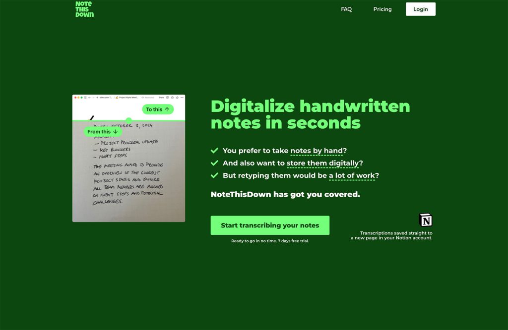
Welcome to our latest toolkit collection.As always, we’ve aimed for a range of apps, utilities, and services to help make life a little easier for des
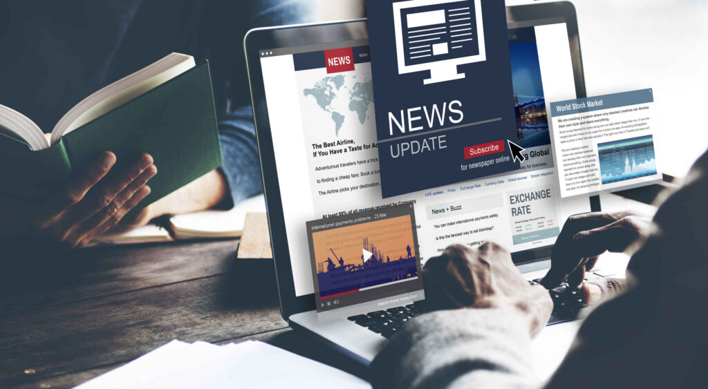
Content is design, and our content is full of clickbait, these days. Sadly, there are many sites that are still using this technique to draw traffic t

It’s easy to confuse what a landing page is because users “land” on many pages. When we talk about landing pages, we mean a page that is entirely dedi

On average, a web page produces 4.61 grams of CO2 for every page view; for whole sites, that amounts to hundreds of KG of CO2 annually.Reducing your w
We are a dynamic information platform dedicated to delivering timely, relevant, and reliable content across a broad spectrum of topics. From the latest in technology and business to lifestyle, health, and global affairs, we aim to keep our readers informed and inspired.
Our editorial team is committed to maintaining high standards of accuracy and clarity, ensuring that every article provides value and context in an ever-changing world. We believe in the importance of accessible knowledge and strive to make complex topics understandable for everyone.
Whether you're here to stay updated on current events, explore thought-provoking features, or simply learn something new, our goal is to offer a trustworthy source of information that meets the needs of a diverse and curious audience.