Freelance mistakes you’ll probably make
Working as a freelancer means that your business is all about you. You’re the sole person in charge of making the tough decisions. You’ll decide how t

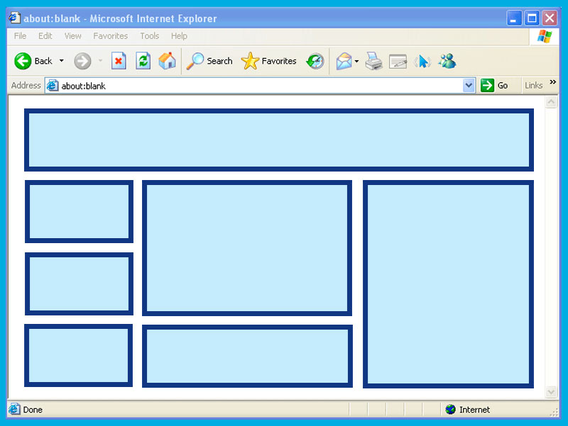
Ah, the humble HTML table. Once the crown jewel of web design, now a relic that makes modern developers roll their eyes and mutter, “Not this again.”
For those who lived through the early internet days, tables were everything.
They weren’t just for organizing data—they were the web designer’s duct tape, scaffolding, and blank canvas. Nested tables? Oh, that’s where the magic (or madness) happened.
Grab your coffee (or therapy cat); we’re diving into the wild world of tables.
Back in the ’90s, CSS wasn’t the stylish, responsive powerhouse it is today. Instead, web designers had one tool to bring order to the chaos of the web: tables. Need a multi-column layout? Use a table. Want pixel-perfect alignment? Add a table inside a table! Fancy a header bar? That’s right, table time.
Developers built sites like Russian nesting dolls, stuffing tables within tables within tables. It was a symphony of Sure, your HTML ended up looking like the blueprint for an IKEA bookshelf, but it worked! Mostly. Sometimes. Until you had to debug it. Ah, nested tables—a concept so notorious, it might as well come with a warning label: “Abandon hope, all ye who enter here.” Let’s say you had a simple layout idea. Easy, right? But by the time you finished nesting tables for your header, sidebar, footer, and “fun, animated GIF section,” your HTML looked like it had been possessed by a rogue AI. Forget styling; you needed a PhD in archaeology just to locate that one rogue Modern devs with their fancy flexbox and grid don’t know the struggles. Nested tables were the original escape rooms of web design. If you could debug a deeply nested table layout in under an hour, you deserved a medal—or at least a drink. Now let’s talk aesthetics. Table borders were an art form. Should you go for solid or dashed? One pixel or three? Fancy double borders? Oh, the possibilities were endless. Of course, if you wanted something truly avant-garde, you’d color each cell differently. Sure, it made your website look like a clown threw up on it, but boy, was it bold. Pro tip from 1998: if your table wasn’t working, just add The arrival of CSS was a bittersweet moment for tables. Suddenly, tables weren’t needed for layout anymore. They were unceremoniously dumped into the “data-only” corner of HTML. Flexbox and Grid swept onto the scene like rockstars, making layout design intuitive and responsive. But tables weren’t bitter. Oh no. They just quietly sat in the corner, waiting for the next poorly designed email template to drag them back into the spotlight. Don’t call it a comeback—they never left. Sure, they’re not the layout workhorse they once were, but tables are still essential for displaying data. Try using flexbox for a spreadsheet. Go ahead, we’ll wait. Tables know their worth. And nested tables? They’re like the eccentric uncle at a family reunion—rarely seen, deeply confusing, and the source of stories that will haunt you forever. Tables may not be trendy, but they’re reliable. They’ve been there for us, through Geocities and beyond. They’ve taught us patience, problem-solving, and how to cry quietly at 2 a.m. while fixing a broken layout. So, let’s pour one out for the humble table. You were the unsung hero of early web design, and for that, we’ll always respect you. Just… maybe stay away from nesting, okay?
Working as a freelancer means that your business is all about you. You’re the sole person in charge of making the tough decisions. You’ll decide how t
A lot of web developers are making me angry. Why? Because they’re literally trying to make it harder for me to build websites. Well, they’re making it
It’s hard to believe we are already closing the books on 2023, but not before we take one last look at the website design trends that shaped the year
Let’s talk about emojis. We all use them—whether it’s a quick to lighten the mood in a text or a to show support.But have you ever thought about how e
We have invoicing apps and scheduling tools. Some resources will save you the trouble of hiring a designer or developer. And there are some really hel
Information density is the amount of information in the form of content that a site visitor is greeted with as soon as he lands on a website or webpag We are a dynamic information platform dedicated to delivering timely, relevant, and reliable
content across a broad spectrum of topics. From the latest in technology and business to lifestyle, health, and
global affairs, we aim to keep our readers informed and inspired. Our editorial team is committed to maintaining high standards of accuracy and clarity,
ensuring that every article provides value and context in an ever-changing world. We believe in the importance
of accessible knowledge and strive to make complex topics understandable for everyone. Whether you're here to stay updated on current events, explore thought-provoking features,
or simply learn something new, our goal is to offer a trustworthy source of information that meets the needs of
a diverse and curious audience.,
, and . Nested Tables: The Russian Doll of Nightmares
that was causing your layout to implode. The Art of Table Borders
border="1". It didn’t solve anything, but at least you could see the chaos you created.Tables vs. CSS: The Great Breakup
Tables Today: The Comeback Kid
In Conclusion: A Love Letter to Tables
Recommended Articles
 tech
tech
Freelance mistakes you’ll probably make
 ux
ux
Usability isn’t just for users
 compilations
10 Best Web Design Trends of 2023
 design
✨Why Emojis Are the Ultimate User Interface ✨
 compilations
Exciting New Tools for Designers, March 2023
 ux
ux
How to Balance Information Density in Web Design
About Us