Pixel Pressure: The Real Stress Behind Being a Freelance Web Designer
Let’s get real for a second: web design isn’t all sleek mockups and creative glory.Sure, the job can look amazing on paper, especially for freelancers

This month’s edition is predominantly characterized by motion, a theme expressed through anything from CGI to video to UI. We’re excited to share this roundup; enjoy!
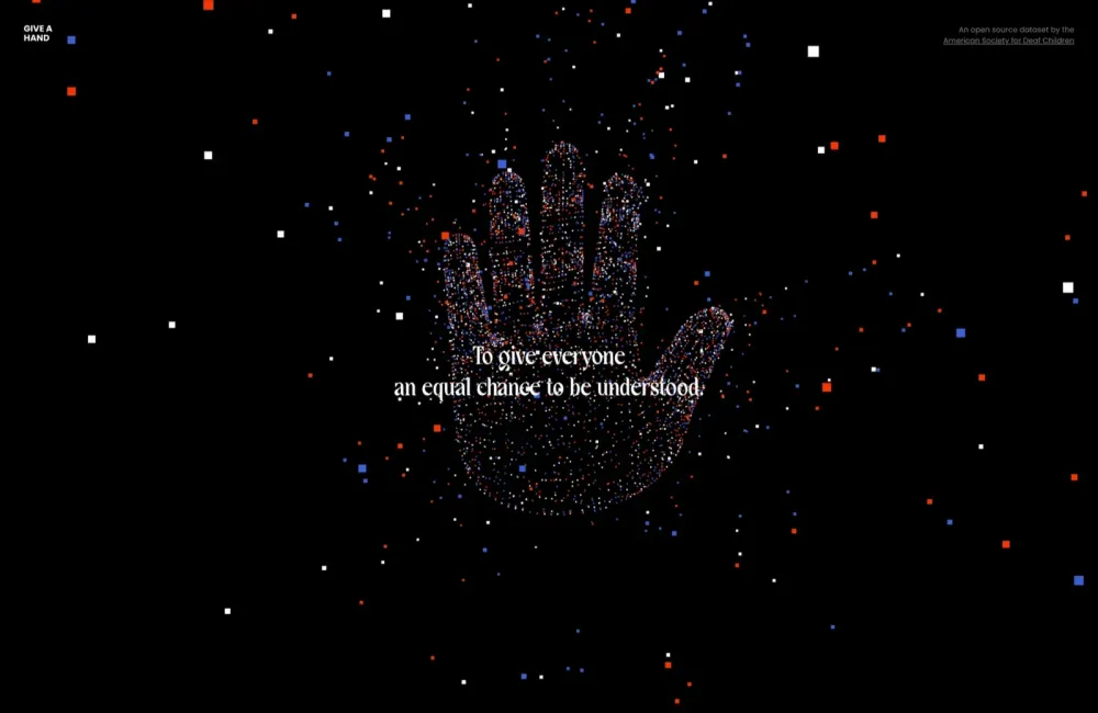
Give A Hand is an incredible project by the American Society for Deaf Children that is building an open-source image library of hands to act as a training library for AI. You can browse the existing data or donate an image of your own hand.
Charlie Pite’s freelance site is an excellent one-pager with a humorous video that sells the tone perfectly. You can watch him get hit in the head with a soccer ball or just scroll down for case studies.
Four Typos is an experimental site that bridges the gap between architecture and interactive design. It’s a beautiful site to explore, with little secrets hidden away for you to discover.
Deon Libra uses a starling red to grab your attention. Its stress-combatting skin care is designed to help your body’s natural destress processes. And refreshingly, for the wellness industry, it’s aimed primarily at black skin.
Boba Ice Cream combines frozen dairy goodness with Asian-inspired flavors. Slick transitions and blocks of bold color combine to create a site you can almost taste.
7Analytics uses hydrology, geology, and data science to study the effects of climate change to help engineers, designers, and architects plan for the future. Its site is nice and slick, and the adaptive cursor is particularly well done.
Apple’s Micro-site for Vision Pro is typically slick, with high-quality product shots against black. As always, Apple uses parallax to walk us, through the features of the product.
Hometeam has a great reel packed with big stars, and its site is as confident as you’d expect with a limited color palette, black and white photography, and video woven in responsibly.
Say Studio is the design and development site for Collin Joyce. It’s straightforward and still impactful, thanks to the large spinning wheel of type that keeps the screen feeling dynamic.
ArK lends money to tech companies. That boring proposition is enlivened by its bold, dark-mode-inspired design and vibrant blue brand color. The noise texture elevates the abstract illustrations to something enigmatic.
PandaPay uses a bold black-and-white color palette to emphasize the simplicity of its product. There’s simple animation, fun illustrations, and some bold typography that catches the eye.
Lane + Co is a London-based creative studio. It stands out in a crowded market with excellent case studies, bold design choices, and a florescent green that’s hard to forget.
Chord Machine is a one-pager for a new musical instrument being funded via Kickstarter. Excellent product photography combines with smooth animation to sell the quality of the instrument.
Élitis makes fabrics, wall coverings, and accessories. Its beautiful site uses slow-pan video and carefully curated product shots to evoke a sense of the exotic.
Alireza is a Saudi Arabian company, and its site leans on the Arabic tradition of the palm tree as a symbol of resilience. The 3D animation shows what can be done with 3D on the web.
Old Friends is a design and development studio with an impressive client list. The main menu nicely adapts depending on where you are on the site, giving it an old-school-web feel.
We love the use of video on Forty Creek’s site because it’s entirely a progressive enhancement that brings the whole site to life.
FinTech is one of the most complex areas to design because there is often no physical product to present. Ramp solves the problem with an elegant site with a dissected UI, simple animation, and a brand gradient that ties into the narrative.
Care of Chan believes that all good things start and end around the dinner table. And who are we to argue? You’ll find all the best places to eat, from Cuba to New York.
Ubunzo is a small but mighty design studio that’s clearly a lot of fun to work with. Its site eschews the usual greys and slick type for colorful animations and a bold UI that‘s a blast to browse.

Let’s get real for a second: web design isn’t all sleek mockups and creative glory.Sure, the job can look amazing on paper, especially for freelancers
The hardest part of designing websites for a living is setting your prices. Setting a fair price for your services is something that nearly all of us
It’s a universal truth that there’s more than one meaning to just about every word. This is doubly true for industry lingo. If you’re just getting sta
How do designers use their own websites to promote themselves online? What are some good ways to set up an online presence that gets you found, puts y

Much has been said about the skills and capabilities of a full stack developer: On one hand, there are people who believe that a full stack developer
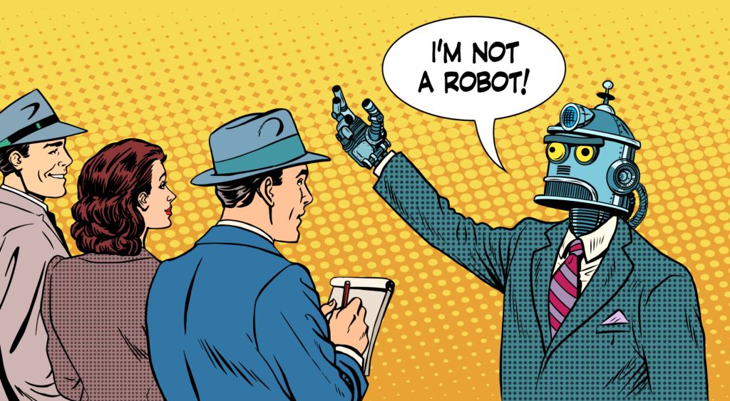
Contrary to the implication in the title, a conversational UX doesn’t have to be a literal conversation, the term refers to back and forth interaction
We are a dynamic information platform dedicated to delivering timely, relevant, and reliable content across a broad spectrum of topics. From the latest in technology and business to lifestyle, health, and global affairs, we aim to keep our readers informed and inspired.
Our editorial team is committed to maintaining high standards of accuracy and clarity, ensuring that every article provides value and context in an ever-changing world. We believe in the importance of accessible knowledge and strive to make complex topics understandable for everyone.
Whether you're here to stay updated on current events, explore thought-provoking features, or simply learn something new, our goal is to offer a trustworthy source of information that meets the needs of a diverse and curious audience.