Are Your Lack of Client Boundaries Costing You Money?
It’s every business owner’s goal to provide a fantastic experience for every client or customer and ensure that each of them walks away happy. But whe

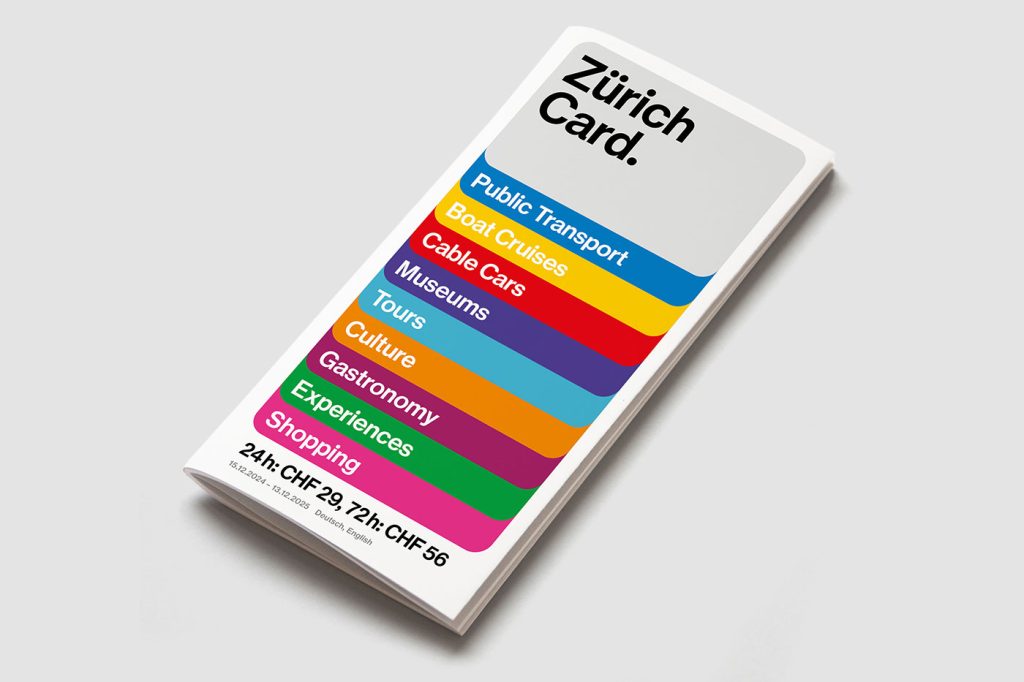
Most city passes look like something you’d shove in your wallet and forget about. The Zurich Card just got the opposite treatment—thanks to Studio Marcus Kraft, it now looks like a piece of design you actually want to show off.
The redesign is built around a stylised card shape, and it’s surprisingly versatile. On one poster it frames a moody photo, on another it morphs into a mosaic of bright squares, and online it flexes into animations.
And yes, the typography is exactly what you’d hope for from Zurich. Clean, no-nonsense, and very much in line with the Swiss International Style—but with just enough personality to keep it from looking like Helvetica’s sensible cousin.
The type works hard, the layout feels modular, and everything connects back to Zurich Tourism’s broader identity system (also created by the same studio, back in 2017).
The visuals have rolled out everywhere: tram wraps, giant posters, social feeds, digital screens, video clips, even the Zurich City Guide app. It’s cohesive without being boring—which is kind of the holy grail of tourism branding.
And here’s the kicker: the Zurich Card itself just leveled up. Alongside free transport and discounts, it now offers free admission to almost every museum in Zurich. Pair that with the new design and suddenly the card feels less like a ticket and more like a cultural invitation.
“The new design creates a visual stage to showcase the numerous benefits of the Zürich Card in an even more emotional and flexible way: from free admission to museums and free travel on public transport to discounts on tours and experiences,” says Janine Rupf, Head of Marketing at Zurich Tourism.
In true Swiss fashion, the whole thing is neat, rational, and ridiculously well put together—but it also has warmth and flexibility. It’s proof that even something as mundane as a city pass can double as a design object.
See the full announcement from Studio Markus Kraft here

It’s every business owner’s goal to provide a fantastic experience for every client or customer and ensure that each of them walks away happy. But whe
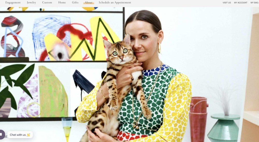
After all, as much as companies may wish it wasn’t true, many consumers still judge a book by its cover. A website that fails to prioritize concepts l
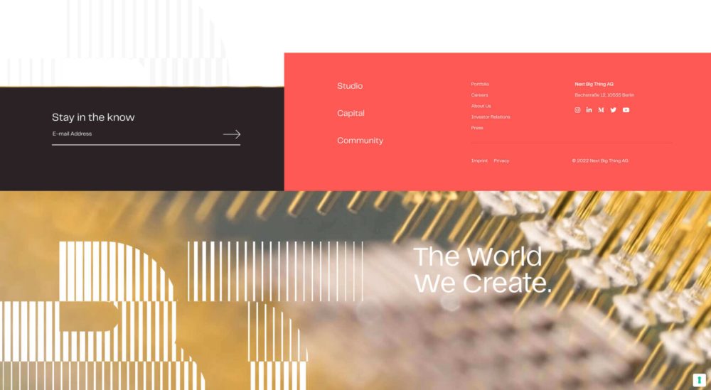
Like shoes, website footers help us see the core of the entity behind the site. A footer is both functional and brand-specific, and it often sets the
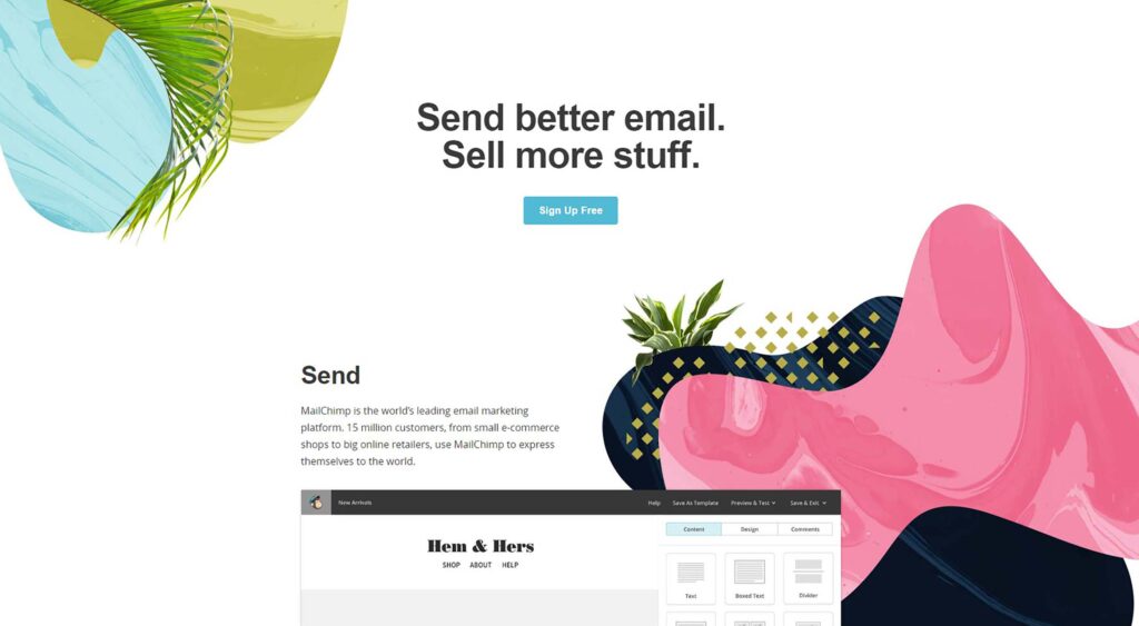
Ok, so you’ve built an awesome digital product—it might be a customer-facing app, an enterprise software, a web app or whatever. You’ve launched and,
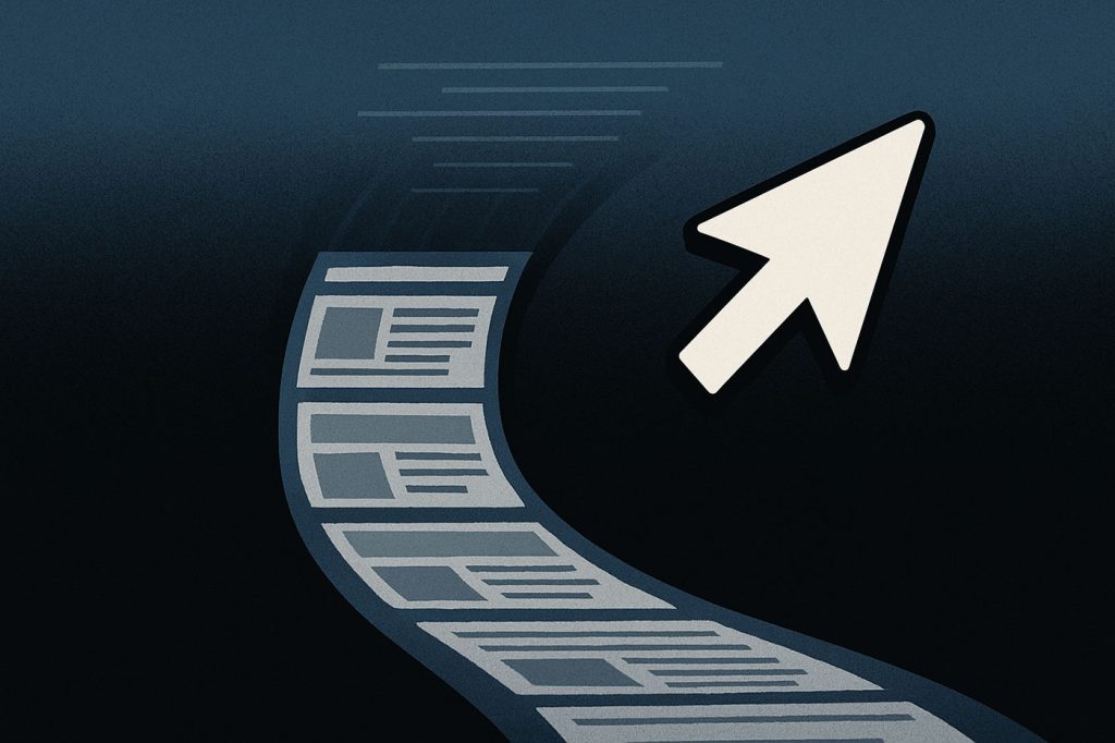
Remember clicking? That sharp, deliberate action where you made a choice, committed to a path, and opened the next door in the digital house? Yeah—cli

There’s a buzzword circulating in tech forums and developer communities that’s hard to ignore: vibe coding.You might have seen it tossed around, somet
We are a dynamic information platform dedicated to delivering timely, relevant, and reliable content across a broad spectrum of topics. From the latest in technology and business to lifestyle, health, and global affairs, we aim to keep our readers informed and inspired.
Our editorial team is committed to maintaining high standards of accuracy and clarity, ensuring that every article provides value and context in an ever-changing world. We believe in the importance of accessible knowledge and strive to make complex topics understandable for everyone.
Whether you're here to stay updated on current events, explore thought-provoking features, or simply learn something new, our goal is to offer a trustworthy source of information that meets the needs of a diverse and curious audience.