The UX Nightmare: Why Tech Is Becoming Unusable for Everyone Except Cyborgs
Remember when technology was supposed to make life easier? That dream is long gone. Instead of simplifying our lives, modern UX has become an enduranc

Social media is the key to any website’s popularity. Taking advantage of the psychological phenomenon known as social proof, social shares greatly influence whether people read content or share sharing it themselves. That’s why social media buttons are on virtually every page that you come across on the Internet.
This begs the question, what goes into the design of these buttons? It’s not a coincidence that they look the way they do, right? You’d think that elements like page placement and positioning, size and color would all have an effect on persuading users to share the content. Designers aren’t just using a willy-nilly approach in creating these buttons. There’s a whole foundation of thinking behind button design.
It’s quite fascinating, actually, and yet so simple at the same time. If you want to increase the chances of page content getting great social shares, it’s in your interest to follow these recommendations.
First things first: Before you worry about designing the actual buttons, it’ll do you good to think about where on a page you should place them.
According to a popular study on user behavior, your site visitors will mostly absorb page content in the F-shaped pattern. This pattern begins with their eyes scanning content from the upper-left corner of the screen and moving horizontally to the right. Then, their eyes go down the page a bit from the point at which they started. After a while, their eyes move horizontally to the right again, but at a shorter distance than the first horizontal scan, before finally moving down one last time along the left side of a page.
[pullquote]Designers aren’t just using a willy-nilly approach…There’s a whole foundation of thinking behind button design.[/pullquote]
Notice where social media buttons usually appear on any given page—they’re along the upper-left portion of the page. This is no coincidence! Designers who place the buttons in this area are following what science tells them about how people read on the web. If you’re not placing the buttons in this area, you’re doing a disservice to your site, since people probably won’t even see them.
And considering that the majority of people scan read a page instead of thoroughly reading it, it’s not unreasonable at all to conclude this.
A good illustration of this is found on a page of the Wall Street Journal site. In an article covering Apple’s decision to begin offering a streaming music service, notice how the social media buttons are placed right where you’d expect to find them: on the upper-left of the page, right beside the prominent headline. According to the F-shaped pattern, people seeing this page the first time note the social shares and then read horizontally across to understand the headline. At the time of writing this article has over 2800 Facebook likes and almost 1200 tweets.
Because people scan and skim pages, it’s always best practice to make things on the page jump out at them. To increase the likelihood of visitors sharing a page, you should design the buttons in a minimal way since that’s how they can be recognized more easily.
You’re better off going with basic, geometric shapes like rectangles, circles and even hybrids of the two, so users understand what they are and what they’re being prompted to do. Further, so many sites use these shapes for social media buttons that not also adopting this approach will actually harm your user experience.
Most of all, users should understand what social media platform they’re sharing to and how many people have already shared the content before them. To achieve this, each platform’s symbol or logo should be clearly visible to users, along with its distinctive colors. That means:
On another note, avoid designing so-called custom buttons that depart from these accepted, best practices in button design. There’s always the temptation to make a site’s elements extra fancy to impress clients or to make yourself stand out as a designer, but it’s really not effective, for the reasons outlined above. The worst case scenario is that users fail to understand how to interact with buttons if they’re too customized.
For a textbook example of a page that pulls off these best practices, we look at Daily Egg’s blog on conversion-rate advice. In an article about reverse-engineering a well-performing landing page, note the placement, shapes and colors of the social media buttons. They’re on the upper-left of the page, are rectangular, and feature the trademark colors of each social media platform.
Like sticky navigation where the navigation follows the user down a page as it scrolls, your social sharing bar should do the same, and for the same reason. You want people to be constantly reminded that they can share your content; incorporating sticky buttons also makes it that much easier for them to share the content because they don’t have to scroll up or down to find your buttons.
[pullquote]You want people to be constantly reminded that they can share your content[/pullquote]
A site that gets this is Marketing Profs, a hub of advertising advice and best practices. Its articles feature sticky social media buttons that stay on the upper-left side of the screen as site visitors continue to scroll down the page.
It’s no secret that social shares are incredibly important to a site’s popularity. The more people share your content, the more other visitors will discover it and potentially become regular readers or customers. That’s why making social buttons easily accessible and noticeable on all pages that include shareable content is a necessity.
Why make it hard for your users to share content that they really like and with which they want to engage? After all, getting more social shares also means a more prominent search engine ranking for the site you design.
Featured image, social media image via Shutterstock.

Remember when technology was supposed to make life easier? That dream is long gone. Instead of simplifying our lives, modern UX has become an enduranc

But first, we will explore what UX research is and how it can give you valuable tools. Then we will analyze why user research is an ongoing, dynamic p
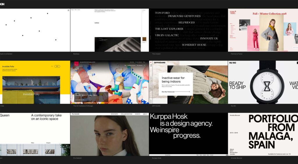
But what if I told you that you didn’t have to write anything for yourself at all? What if I told you that there are thousands—if not millions—of hard

At least once every day, some designer somewhere in the world will look at something made months or years ago; failing that, some executive will get t

The thing about human beings is that you can’t trust them with anything. Okay, maybe that’s a bit unkind. However, it’s a simple truth that even the m
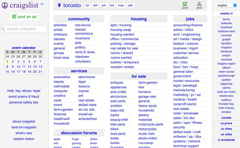
In a world where even government websites are undergoing sleek makeovers, Craigslist remains a stubborn relic of the early 2000s internet.With its sta
We are a dynamic information platform dedicated to delivering timely, relevant, and reliable content across a broad spectrum of topics. From the latest in technology and business to lifestyle, health, and global affairs, we aim to keep our readers informed and inspired.
Our editorial team is committed to maintaining high standards of accuracy and clarity, ensuring that every article provides value and context in an ever-changing world. We believe in the importance of accessible knowledge and strive to make complex topics understandable for everyone.
Whether you're here to stay updated on current events, explore thought-provoking features, or simply learn something new, our goal is to offer a trustworthy source of information that meets the needs of a diverse and curious audience.