Adobe Cracks Down on Employees’ Generative AI Usage
Adobe Places Restrictions on AI UseNew information from Business Insider reveals that Adobe has instructed its employees not to use personal email acc

Here’s what’s trending in design this month.
Dark backgrounds are a design trend that never goes out of style. (Thank you, dark mode!)
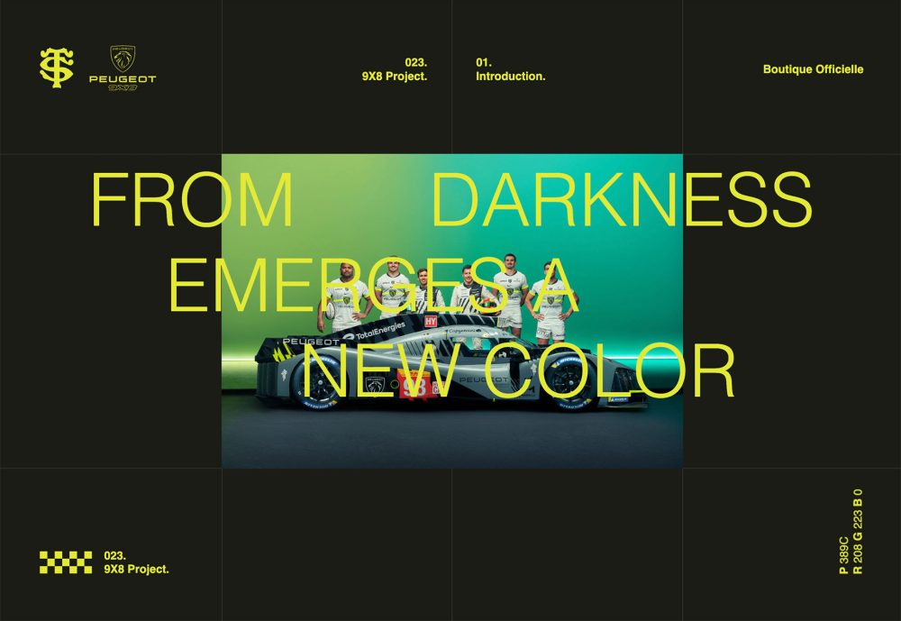
The subtle shift has been in the color of accompanying text elements, from light or white to bright color. This creates a more cheerful emotional connection to the design with a slightly less stark feeling.
Bright colors can be almost anything if the background is fully dark. The high contrast between dark and bright will ensure readability. The challenge comes in when secondary elements are lighter and can cause concerns about reading with ease.
The 9×8 Project uses some of the brightest colors – neon yellow – but a background image shows how some readability concerns can come into play. In the dark areas, though, the text is quite readable, even at small sizes.
Dan Iqbal uses a dark background with bright orange text for his portfolio design. Everything is easy to read, and the color is engaging. The background rotating text is a nice additional touch.
Finally, Keelvar shows that bright color choices can be somewhat unexpected. A bright purple might not be your first choice, but it pulls elements together in this design nicely.
Card elements keep evolving in different ways, and this website design trend is no exception with card-style elements that all have curved edges. (Most of them almost seem to use the same degree of curvature as well.)
What’s nice about these cards is that they work with any other design style. The examples below show how they integrate well with a white background and image content, animated card styles, and even cards within cards in an almost brutalist design scheme.
Curved edge cards can be flat, have dimension or depth due to shadows, or include animation or hover effects. Content can be practically anything from images to text to video to combinations of all of them.
Here’s how three different websites are doing it.
GET has the simplest of card styles here, with oversized, vertical containers with curved edges. There are text and CTA elements in each. The cards do their job here, creating a visually stunning focal point for the homepage with interactive cues.
Same Same Studio stacks two rows of small cards with a lot of color. Each is a button with calls to action that drop in with a hover state. What’s neat about the cards is that the content therein is different with photos, animation, video, and still frames. It shows how much opportunity is available with this design technique.
Zach Hayes places cards inside cards inside cards on his portfolio website. Every element uses the same curve for edges, and the bright white aesthetic is pleasing. Depth elements on cards and typographic elements contribute to the brutalist feel of the project.
These designs might leave you asking – where’s the grid? Zig-zag patterns for images and even text can create an on- or off-balance feel, depending on usage. Either version can establish a visual theme that can work on a homepage or for a complete design.
Zig zag alignments can be vertical or horizontal or include stair-step type elements. All of these styles have an off-the-grid feel, but for the most part, they are on a grid, just not the one you might expect. (A half grid can help you keep this style organized with a clear path and positioning for elements.)
You need a few items to establish a pattern to make this work effectively. On the other hand, you don’t want too many elements in the zig-zag pattern because it can get overwhelming. Ideally, you have somewhere between 3 and 7.
Mocha Café and Bar zigs and zags with the letters that make the business name. There are two horizontal baselines for text that keep the typographical chaos organized.
Swiss Deluxe Hotels is using this technique vertically and horizontally, which shows that it can be challenging when it comes to responsiveness. This design looks best and is most readable on larger screens.
Oaks Lane features a stair-step pattern of images that continues from the homepage throughout the scroll in the design. The step sometimes appears on the top line for images but also is used below image frames as well. This method of using a zig-zag style can be quite elegant but requires a highly intentional photo selection for effectiveness.
Sometimes subtle design trends are the best and most practical when considering how to use or incorporate them into your projects. Think of it as an evolution of something you are already doing.
Then a few design evolutions later, you have a whole new design scheme without a significant facelift. This can be an excellent option for your design team and users!

Adobe Places Restrictions on AI UseNew information from Business Insider reveals that Adobe has instructed its employees not to use personal email acc

When your grandkids ask you where you were when AI took over, you’ll be reminiscing about February 2023.ChatGPT Goes ‘Pro’First, we felt a great distu

The UX designer has devised a series of tests to determine if a green button is better than a red button. One of them involves tipping a tortoise onto

Over the past several years, augmented reality (AR) technology has established a home in entertainment, marketing, education and many other industries

Even Apple is in on the trend; the company introduced a host of changes in both its mobile and desktop operating systems that use the style. The eleme

WordPress has made it easy for everyone to launch a blog, but even though launching a blog isn’t a difficult task any longer, driving traffic to your
We are a dynamic information platform dedicated to delivering timely, relevant, and reliable content across a broad spectrum of topics. From the latest in technology and business to lifestyle, health, and global affairs, we aim to keep our readers informed and inspired.
Our editorial team is committed to maintaining high standards of accuracy and clarity, ensuring that every article provides value and context in an ever-changing world. We believe in the importance of accessible knowledge and strive to make complex topics understandable for everyone.
Whether you're here to stay updated on current events, explore thought-provoking features, or simply learn something new, our goal is to offer a trustworthy source of information that meets the needs of a diverse and curious audience.