10 New Year’s Resolutions Every Web Designer Will Definitely Break
It’s New Year and that special time when we vow to become better versions of ourselves—only to realize by January 15th that, well, that ain’t happenin

Here’s what’s trending in design this month:
One-color design patterns can be beautiful and somewhat enchanting. With tints and tones of the same base color, there is a certain elegance that comes with a monochrome color scheme.
Designers who have worked with color in this way know that while the end result may look simple, the plan for creating it can be anything but! Especially with website design, when you have to think about contrast and accessibility, a monochrome design takes a lot of planning.
You can do it in a few different ways – with background and foreground colors or patterns. With images. With text color. There are a lot of possibilities.
The trick to making it work is to use monochromacy in a way that sets the right feel but maintains readability. Often, that means you will use dark or light text elements with your otherwise single-color theme.
Belka Games uses a coral theme with a very light background version of the color with a bold bright version for text elements (with black accents). It’s easy to read and has a fun feel, thanks to the color choice and font selection.
Deadly Secrets of Color Green uses a green patterned background with multiple layers and an animation that uses a few more shades. The text is colored in the same monochromatic feel in the hero area (although it flips to white for most of the rest of the design). It’s a fun design, and the color carries throughout.
TwinBru uses an unexpected beige-mauve monochromatic color scheme with nifty animations in similar colors. The site, which is about performance fabrics – is designed in such a way that you can almost feel what they are talking about, thanks to color and animation.
There’s something that feels both kind of retro and modern with magazine-style website layouts. As a carryover from print to the web, these designs often have big images, plenty of space, and oversized headlines.
While you might find some animation, the design is often rather flat – hence the retro feel – and almost all of the design elements are in their own containers without a lot of layering or overlap.
The great thing about a magazine-style layout is the design is easy to read and follow. While they might look super simple to create, it does take a lot of planning to get just the right harmony for all of the pieces.
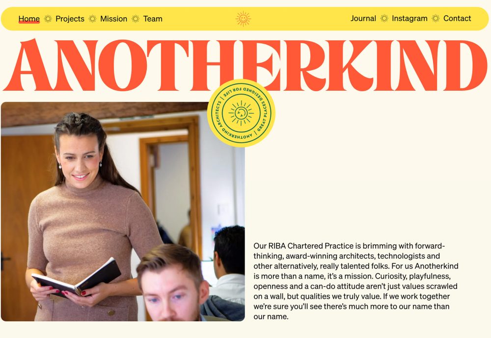
Anotherkind plays up the retro feel with the typography used in the main site title and page headline. The serif with orange color is bold and leads the eye down the screen. Plenty of space before the main copy block is also an homage to print.
Synchrodogs uses a similar aesthetic with even more of a print feel. Did you notice the navigation tucked into colored boxes at the top? (It’s such a small detail that you might have missed it in comparison to the size of the main headline.
Brooklyn Editions goes in a totally different direction visually but still has a very magazine-style design. This is magnified on the scroll as you can almost feel the pages turning between content elements. The stark cover is also in contrast to more colorful elements “inside,” but the overall feel is not lost.
Making navigation elements stand out and easy to find is almost always part of a web designer’s charge. (It’s almost as common as “make the logo bigger!”)
One way to ensure that navigation always has a clear space and doesn’t get lost in the mix of other elements is to box it. Containerizing menu items ensures that they always appear as intended, and there are no worries about sacrificing readability if there are a lot of things happening in the background.
Boxed navigation can be fixed or sticky and even have a shrinking container, if necessary. This is a solution that’s been gaining quick popularity because of the ease of readability and interactivity for users.
The look of boxed navigation can vary, though. That’s where your creativity comes in. Here are three different ways to think about it:
Brand New School takes a fairly traditional approach with boxed navigation at the top of the screen. The full-width menu is in a white box and includes a logo, navigational items, and shopping link. The Easter egg is in the light mode/dark mode toggle, which then swaps the whole design color scheme, including the nav.
Gotham NYC takes a slightly different approach with two layers of boxed navigation – one with menu items and a second, smaller element for address and hours. The boxes have curved edges and an opaque color for ideal readability so that the boxes don’t seem obtrusive.
DPTO goes all in on the boxes concept and believes in it enough to anchor the navigation at the bottom of the screen in a bright yellow container. With the color scheme of the design, there’s little way to miss the navigation, but any nontraditional placement can be risky. The box definitely helps pull it all together here.
While many of this month’s design trends aren’t all that radical, they do involve thinking about the entire site design to deploy. These are not things you can just sprinkle into an existing design with ease.
They are great ideas, though, as you start new projects. Have fun!

It’s New Year and that special time when we vow to become better versions of ourselves—only to realize by January 15th that, well, that ain’t happenin
Alright, so let me begin by addressing the title because there is a method to my madness: There are literally hundreds of articles out there with tips
The autumn air is fresh and clear, the light is soft and uplifting and the autumnal forests are at their most beautiful. Combined with some smooth Swi

For years, we thought video was the peak of online storytelling—painstakingly edited YouTube explainers, expensive brand commercials, polished Netflix
Here’s what’s trending in design this month:1. Monochrome Color SchemesOne-color design patterns can be beautiful and somewhat enchanting. With tints
As regular readers will know, each month we roundup the best new designs of the previous 4 weeks. And now, at the end of the year, we’ve selected our
We are a dynamic information platform dedicated to delivering timely, relevant, and reliable content across a broad spectrum of topics. From the latest in technology and business to lifestyle, health, and global affairs, we aim to keep our readers informed and inspired.
Our editorial team is committed to maintaining high standards of accuracy and clarity, ensuring that every article provides value and context in an ever-changing world. We believe in the importance of accessible knowledge and strive to make complex topics understandable for everyone.
Whether you're here to stay updated on current events, explore thought-provoking features, or simply learn something new, our goal is to offer a trustworthy source of information that meets the needs of a diverse and curious audience.