Design Handoff Pitfalls: Common Mistakes and How to Avoid Them
When it comes to web design, the handoff process is where the magic (or more often, the chaos) happens.For many advanced designers, this phase — where

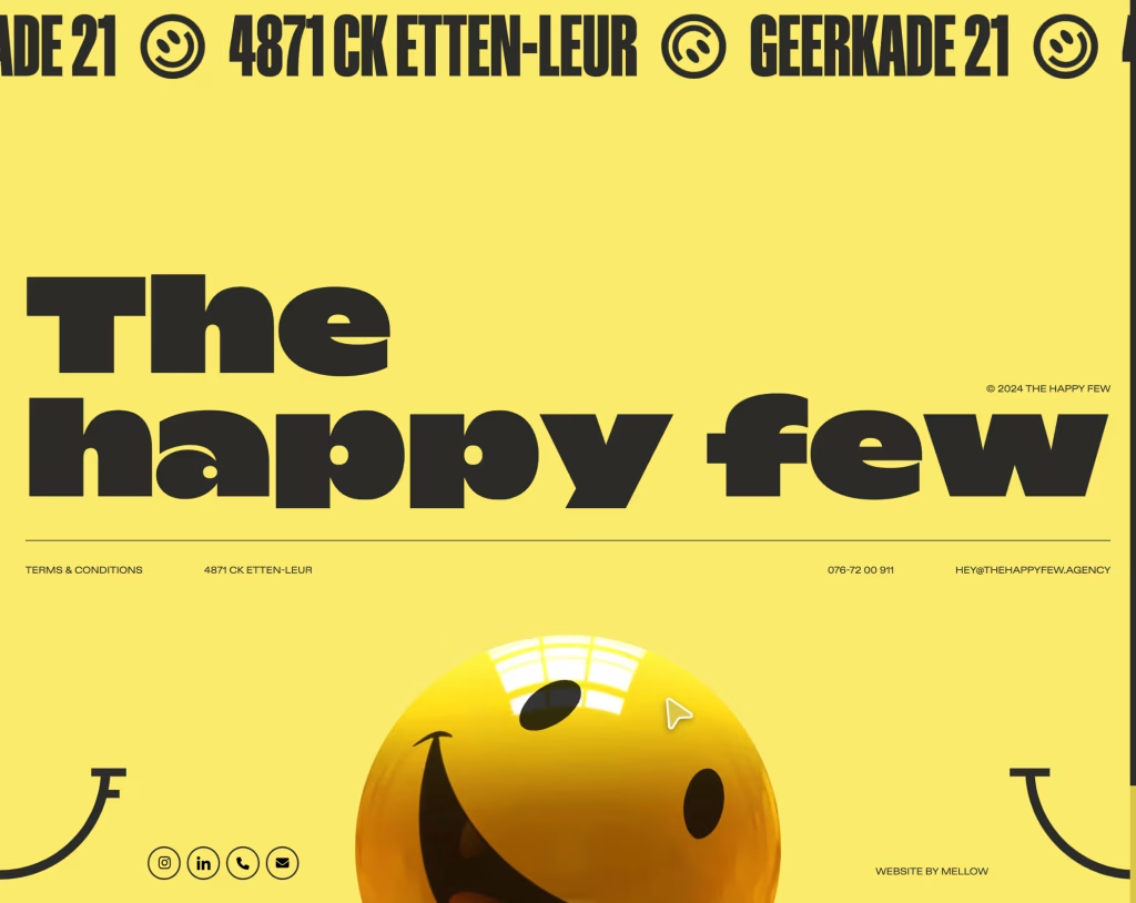
Footers—often treated like the forgotten bottom shelf of your website’s pantry. Designers pour their energy into flashy homepages and slick navigation, leaving the footer to fend for itself with a few links and some legal mumbo jumbo.
But here’s the kicker: footers are just as important as the rest of your page. They’re your last chance to impress users before they bail.
The problem? Many designers are still living in the past, clinging to outdated myths. Footers don’t have to be boring, cluttered, or just a dumping ground for links. They can (and should) be strategic, creative, and engaging.
In this article, we’ll bust those footer myths wide open and show you how to create footers that not only look amazing but also work. Let’s make your footer the hero of your site, not the sidekick.
Tip: Footers are prime real estate—use them to actively engage users, not just shove legal text and links. While you’ll still need your legal disclaimers (no one’s arguing that), your footer can also be the perfect spot for special offers, CTAs, or social proof.
Add elements like a newsletter sign-up, an exclusive “sign up for early access” button, or a featured product carousel. For blogs, you can include the latest articles or encourage users to explore specific categories. Transform the footer from a “dumping ground” for legalese into a dynamic call-to-action area that engages and directs users toward their next action.
Tip: The traditional column-based layout is old news. Sure, it works, but it’s not the only option—especially if you want to stand out. Break away from the rigid grid structure and opt for creative, asymmetrical designs or full-width footers that make your brand pop.
Think of it like a visual signature—your footer should reflect the same creative energy your main site does. Use large, bold typography or play with icon sizes to make it visually interesting.
A fluid, unconventional design that is both functional and creative will reinforce your site’s personality and keep users engaged longer.
Tip: Minimalism doesn’t mean dull or sparse. Less is more, but only if you’re offering users highly targeted, actionable content. Yes, prioritize key elements like contact info and essential links, but also add more value-driven content.
If you’re running an e-commerce site, display current deals, or add a compact product showcase in the footer. For a portfolio or creative agency, highlight recent work or include a quick contact form to boost conversions. It’s all about using the minimal space to provide the maximum impact, rather than just stuffing it with empty real estate.
Tip: Dynamic footers are the future. Don’t let your footer be a static, lifeless block of text at the bottom. Use hover effects to reveal more options, like social media profiles or a brief about us pop-up. Incorporate micro-animations to highlight links or showcase items as the user scrolls.
You could even embed a live chat widget that pops up in the footer, offering users a chance to ask questions at the last point of engagement. Try a sticky footer that hovers as the user scrolls, always visible with relevant CTAs or contact info.
Footers don’t have to be passive; make them interactive, and encourage user participation until the very last scroll.
Tip: Footers shouldn’t be invisible. Sure, they shouldn’t steal focus, but they can still be a subtle standout. Use a complementary color to your website’s palette—something different enough to create contrast but not jarring.
Play with texture or gradients to make the footer visually interesting without overwhelming the design. Think of it as the perfect “bookend” to your site—eye-catching but not demanding attention. Keep it sleek with a few well-placed design elements like custom icons or minimalistic patterns. This will keep your footer noticeable and help it feel like a cohesive part of your site’s design story.
Tip: Mobile-first design isn’t just a trend, and neither is mobile footer optimization. Mobile users often scroll to the footer when they’re looking for important info, and a footer that’s poorly designed on mobile is a conversion killer.
Ensure your footer is responsive by using collapsible sections or accordion-style menus for your links. Consider keeping only the essentials visible on mobile—like a clean, streamlined contact form or quick links—while keeping the clutter hidden behind an expandable section.
It’s essential that the footer adapts fluidly on any screen, so no matter how the user interacts, it’s easy to navigate and responsive across all devices.
Tip: Footers don’t have to be all text links, and your users will thank you for it. Swap out those boring, static text links for interactive elements like clickable icons, buttons, and even embedded multimedia.
Use SVGs or animated icons for your social media links, add visuals that represent your content (such as a small portfolio carousel), or embed real-time elements like Instagram feeds.
The footer should feel like a destination, not just a dead-end. Whether it’s a live chat widget or an auto-updating blog section, an engaging footer will make users more likely to interact with it.
No one wants to be greeted by a legal wall of text in the footer. Yes, you need it, but it doesn’t need to be the first thing users see. Tuck legal content (like privacy policies and terms) away in a neatly labeled section that users can access when needed.
You can add a discreet link to the footer’s bottom or within a small section marked “Legal” or “Privacy.” Users will appreciate that you’ve made this information accessible without sacrificing the footer’s usability for your main content.
Tip: Footers are often underused when it comes to dynamic content—but this is a huge missed opportunity. For example, if you’re running an e-commerce store, showcase real-time deals in the footer, like “Limited time: 15% off all items!” or “Hurry, only a few items left in stock.”
You can also highlight recent blog posts, integrate live social media feeds, or show recently viewed products to encourage users to take action before they leave. A dynamic footer that changes with user behavior is way more powerful than a static one.
Tip: Footers aren’t just a “leftover space” at the bottom of the page—they’re part of your brand identity. Align your footer design with your overall aesthetic: if your website uses bold typography and vibrant colors, reflect that in your footer.
If your brand is sleek and minimalist, keep the footer streamlined and simple. Footers are a final touch that reinforces your visual narrative. Integrating brand elements (like logos, colors, or fonts) into the footer keeps the user journey cohesive, reminding users of who they’re engaging with until the very end.
Tip: No one reads everything in a footer—so don’t give them too much to skim! Cut back on excessive text and links, and prioritize what truly matters.
Group similar items (e.g., FAQs, Contact Us, or social media links) into categories to keep the footer organized and easy to digest. If you have a lot of content, break it down into expandable sections or consider adding a search bar so users can quickly find exactly what they need.
Focus on the essentials, and let the footer guide users without overwhelming them.
Tip: You don’t need to flood your footer with every single link on your site. Too many links make it cluttered and hard to navigate. Instead, limit the links to just the most important, user-friendly ones. Group related items (like “Contact Us,” “FAQ,” or “About Us”) in a neat, clickable section.
You can also use dropdowns or expandable menus to keep it neat and uncluttered. Always ask yourself: “Will this link really help the user?” If not, don’t include it.
Tip: Sticky or floating footers are a game-changer. Why should users have to scroll all the way to the bottom of the page just to find your contact info or CTA? Make important information visible by keeping it fixed as users scroll.
Whether it’s a simple “Contact Us” button or your latest blog post, this makes essential content always accessible and encourages interaction throughout the user’s session, no matter where they are on the page.
Tip: Personalization in the footer is a powerful way to connect with users and boost engagement. Use the footer to highlight personalized content, like “Products You May Like,” “Your Recently Viewed Items,” or even offer a personalized discount based on past interactions.
For logged-in users, use the footer to display their account info or offer them the chance to quickly access their profile. Personalizing the footer ensures users feel like the site is built for them, which increases engagement and retention.
Tip: Footers are an untapped SEO opportunity. Add important internal links to key pages (like product categories, blog posts, or popular services). Use keywords subtly in footer content like descriptions or mini-sitemaps.
Adding relevant anchor text in the footer can boost your internal linking strategy, and help search engines crawl your site more effectively. Just remember to avoid keyword stuffing—keep it natural and user-focused.
Tip: Footers must be responsive in today’s mobile-first world. For mobile users, make sure the footer adapts with features like collapsible menus, accordion-style links, or compact CTA buttons.
Use flexible layouts that reformat based on screen size. Don’t make mobile users scroll endlessly to get to the footer content. Keep it simple, yet functional, with quick access to critical links and CTAs.
Tip: Footers should entertain and convert, not just function. Inject some creativity! Use fun typography, bright colors, and even animated icons to create something visually engaging.
You can even make the footer interactive, with hover effects or animated elements that react to the user’s scroll. It’s the last thing users see on your page, so make it unforgettable. A footer that’s as creative as your main content is a huge win.
Tip: Footers are prime territory for CTAs! Don’t shy away from using the space for prompts like “Subscribe Now”, “See Our Latest Work,” or “Get a Free Quote.”
Footers are a last chance to drive users to take action, and placing CTAs here can significantly improve conversions. The footer is an ideal place to offer value with low-pressure options, like subscribing to a newsletter or signing up for an account.
Tip: Break the mold with creative layouts! Don’t just settle for a grid or list of links. Use unique arrangements, like split footers that separate contact info from social media icons.
Consider multi-column designs, custom iconography, or background images. Customizing the layout based on the content’s importance or user needs will make the footer feel integrated with the rest of your site’s experience.
Tip: Customize your footer based on page context. For example, on a product page, feature checkout links or related products; on a blog, show recent posts or popular articles.
Tailor it to fit the user’s journey—the footer should change depending on where they are on the site and what they’re doing. A more relevant footer keeps users engaged, helping them find exactly what they need.
By expanding your footer’s role and breaking the myths that keep it limited, you can transform this often-overlooked section into a powerhouse of user engagement and conversions.
The key is creativity, relevance, and functionality—and with these tips, your footer will stand out in the best way possible.
Need some ideas? Check out Footer.design for inspiration (not sponsored)

When it comes to web design, the handoff process is where the magic (or more often, the chaos) happens.For many advanced designers, this phase — where

According to a recent QuickBooks survey, the #1 reason freelancers go into business for themselves is because it lends them the freedom to shape their

When it comes to compliance, website developers need to keep their eyes on more than just ADA regulations and Section 508. Privacy laws are a big cons
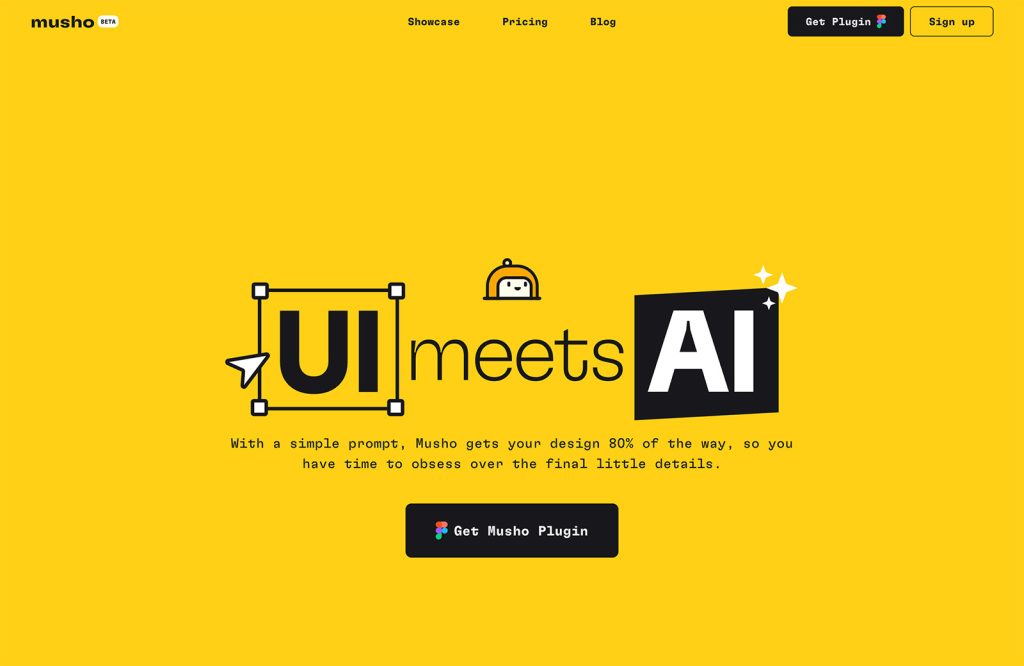
This year, we’ve seen a wave of groundbreaking apps and tools. AI is reshaping the industry, enhancing productivity, and helping us work smarter, not

We spent decades perfecting the art of navigation: breadcrumbs, sidebars, hamburger menus, sticky headers, site maps. We crafted taxonomies and ran he
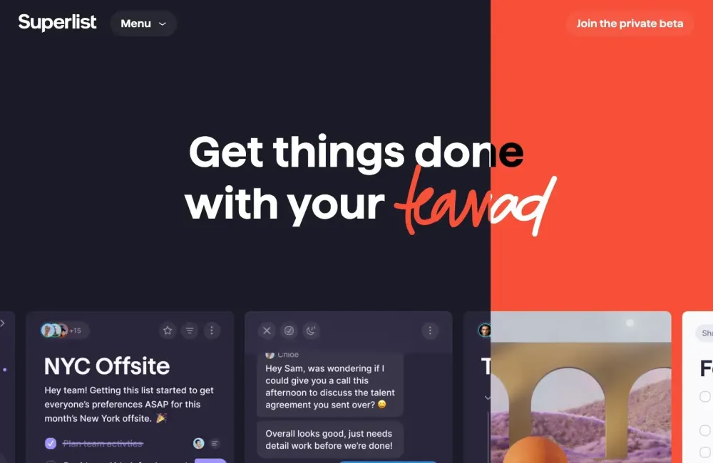
In this month’s roundup of the most exciting new downloads for designers and developers, there are many AI-powered tools, services to simplify your ap
We are a dynamic information platform dedicated to delivering timely, relevant, and reliable content across a broad spectrum of topics. From the latest in technology and business to lifestyle, health, and global affairs, we aim to keep our readers informed and inspired.
Our editorial team is committed to maintaining high standards of accuracy and clarity, ensuring that every article provides value and context in an ever-changing world. We believe in the importance of accessible knowledge and strive to make complex topics understandable for everyone.
Whether you're here to stay updated on current events, explore thought-provoking features, or simply learn something new, our goal is to offer a trustworthy source of information that meets the needs of a diverse and curious audience.