Feedback Fatigue: Why AI Will Stop Asking for Your Opinion
Let’s talk about the ancient art of the thumbs-up and thumbs-down — once the sacred, clumsy handshake between user and algorithm.In the early days of

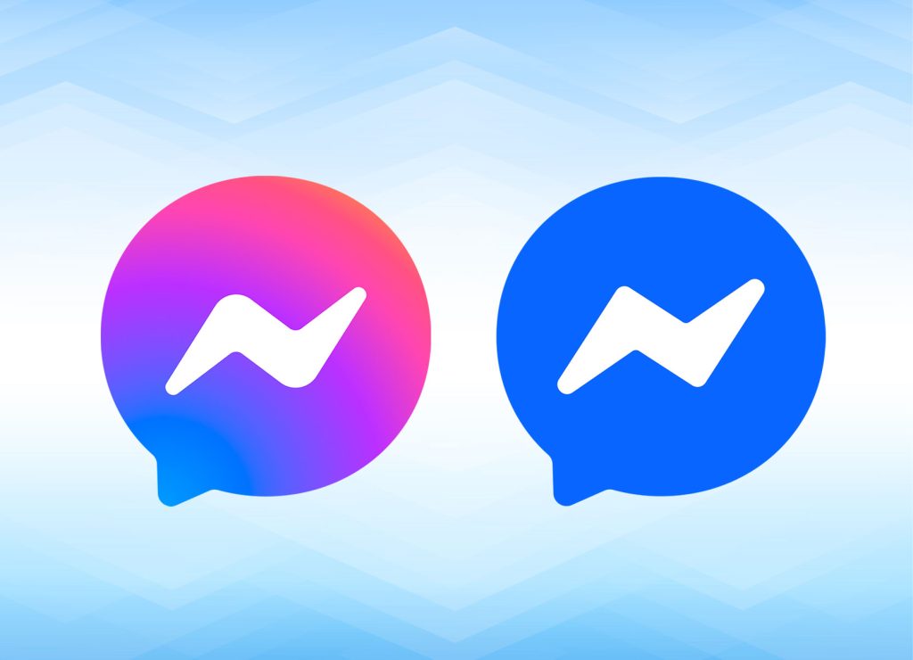
In a move that’s left the internet shaking its head, Meta has swapped its bold, colorful Facebook Messenger logo back to the bland blue of its early days. After years of embracing a vibrant purple and pink gradient that symbolized progress and a fresh start, Meta’s decision to revert to the old blue has been met with confusion, frustration, and a lot of raised eyebrows.
Why now? Why go backward at a time when the company is struggling to maintain its image and relevance in a world where every move feels like it’s under the microscope? The change seems particularly tone-deaf given Meta’s current PR mess, including Zuckerberg’s recent anti-woke moves and the company’s desperate attempts to regain trust after a series of scandals. So why would Meta choose this moment to make such a questionable, backpedaling design decision?
In 2020, Meta—then still Facebook—unveiled its bold new Messenger logo as part of a broader strategy to integrate Facebook Messenger with Instagram’s messaging platform. The gradient was fun, dynamic, and, frankly, screamed “we’re the cool, modern social platform!” But fast forward to 2025, and the new-old blue logo feels like a desperate attempt to embrace the past—and maybe distance themselves from the progressive ideals that the colorful logo represented.
The timing of this switch is crucial. Meta has been in damage control mode for months, and this move feels less like a fresh branding choice and more like an attempt to salvage something—anything—after Zuckerberg’s controversial decisions to pull fact-checking from Facebook and align the platform with more right-wing sentiments. Some have even speculated that the switch back to blue is a reaction to the rainbow gradient, with conspiracy theories swirling about Meta’s desire to shed any ties to LGBTQ+ pride. Whether this is true or not, the optics aren’t great.
But this flip-flopping behavior is nothing new for Mark Zuckerberg, who’s built a reputation for constantly shifting his stance to serve whatever narrative benefits him in the moment. From Facebook’s infamous data privacy scandals to the company’s attempt to position itself as a “metaverse” leader (before it all came crashing down), Zuckerberg has shown time and again that he will do whatever it takes to appease investors, users, and political factions, even if it means abandoning earlier promises or changing direction entirely. It’s as if he’s navigating a corporate identity crisis without any clear compass—and the public is getting whiplash as a result.
Then there’s the user backlash. The gradient was a symbol of modernization, of Meta attempting to stay relevant. The return to the safe, corporate blue logo? It feels lazy. It feels like a retreat. The once dynamic and progressive company now looks stuck in the past. Critics are calling the blue version “basic” and “uninspired,” which, in the fast-paced world of tech, is a death sentence. If Meta can’t even get a logo right, what else are they messing up?
Beyond the design itself, the logo flip speaks volumes about Meta’s crisis of identity. In a world where branding is everything, this feels like a monumental misstep. A company that once championed innovation now appears stuck in the muck of its own corporate identity crisis. Is this a sign of more to come? Will Meta continue to flounder as it tries to figure out who it really is? For now, the answer seems to be “we don’t know”—and neither does anyone else.
Meta’s Messenger rebrand might seem like a minor detail, but in a company as scrutinized as Meta, every move counts. And this move? It’s a disaster, plain and simple. Zuckerberg’s constant flip-flopping has only added fuel to the fire, as users and investors alike wonder: What exactly does Meta stand for anymore?
Let’s talk about the ancient art of the thumbs-up and thumbs-down — once the sacred, clumsy handshake between user and algorithm.In the early days of
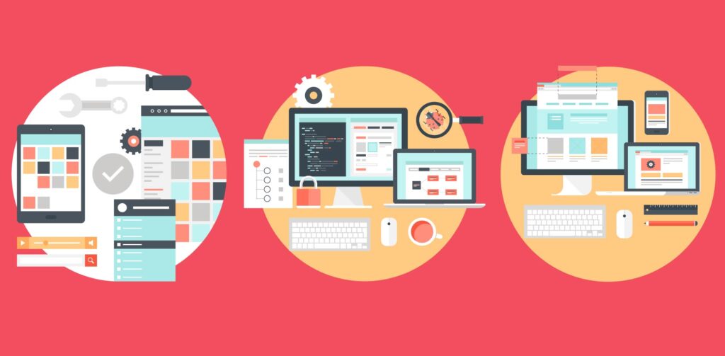
User scenarios are the stories that your personasp0o act out. Basically, user scenarios are thought exercises (though represented visually) in which y
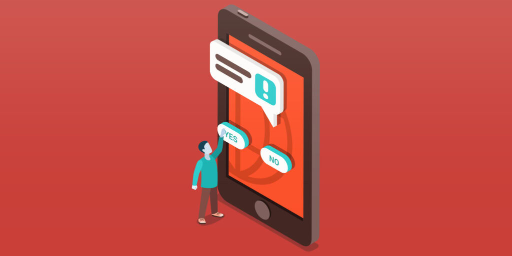
One thing that not enough designers focus on when designing websites is cutting down on user errors. That’s a pity because user errors have a direct i

Yes. Yes it should. There’s no doubt that there are terrible people in the world; but anonymity is a powerful tool for good as well. Here are some of
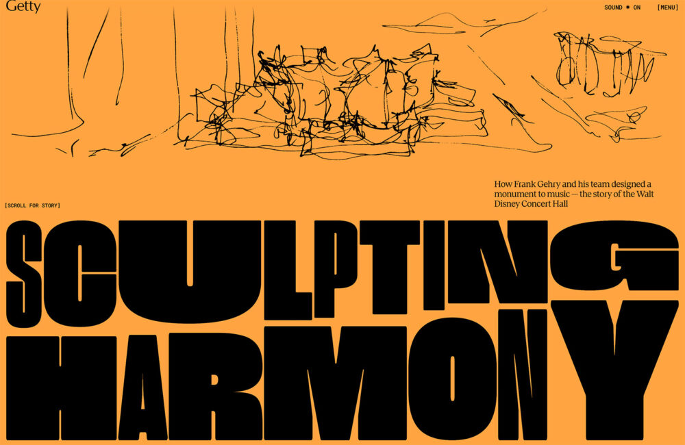
In this month’s collection we’ve got some really beautiful examples of what can be done with a few images, a couple of great fonts, a handful of color
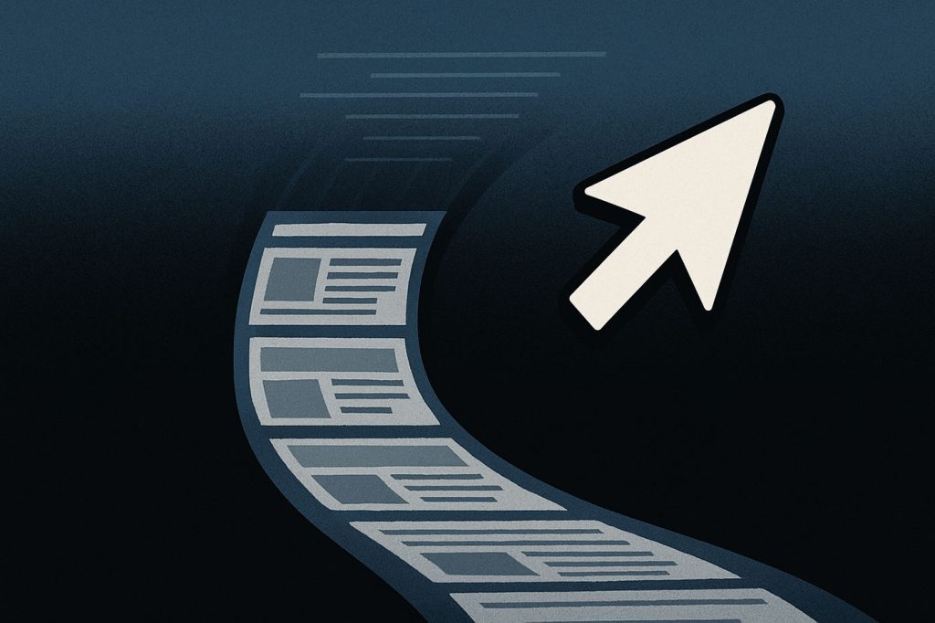
Remember clicking? That sharp, deliberate action where you made a choice, committed to a path, and opened the next door in the digital house? Yeah—cli
We are a dynamic information platform dedicated to delivering timely, relevant, and reliable content across a broad spectrum of topics. From the latest in technology and business to lifestyle, health, and global affairs, we aim to keep our readers informed and inspired.
Our editorial team is committed to maintaining high standards of accuracy and clarity, ensuring that every article provides value and context in an ever-changing world. We believe in the importance of accessible knowledge and strive to make complex topics understandable for everyone.
Whether you're here to stay updated on current events, explore thought-provoking features, or simply learn something new, our goal is to offer a trustworthy source of information that meets the needs of a diverse and curious audience.