User Journeys vs. Customer Journeys: Why the Distinction Matters More Than You Think
Let’s get something out of the way: “user journey” and “customer journey” aren’t interchangeable buzzwords you can toss around to sound smart in meeti

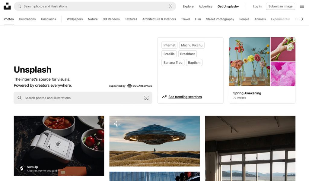
Have you ever visited Unsplash, that go-to treasure trove of beautiful, free stock images, and wondered why on Earth they’ve decided to clutter their homepage with two search bars?
If you’re like me, the moment you land on the page, you’re hit with the digital equivalent of a double shot of espresso: an overwhelming redundancy that adds absolutely no value to the user experience. In the world of web design, where simplicity reigns supreme, Unsplash’s homepage is guilty of a rare offense – excessive complexity in the form of two almost identical search bars.
Before we dive deep into why this is problematic, let’s be clear about one thing: Unsplash’s image library is incredible. The free, high-quality photos are a game-changer for designers, creatives, and marketers alike.
But just because you’re winning at one thing doesn’t mean you should get a free pass on all things design-related. And this double-bar fiasco? It’s a design misstep that needs a little bit of a deep dive.
Here’s the thing: simplicity is a fundamental principle of great web design. No one likes a cluttered homepage, and no one likes hunting through a page to figure out where the information they need is located.
In fact, studies have shown that people make decisions about a website’s quality within mere seconds of landing on it, and one of the first things they’ll judge is how easy it is to navigate. So, what message does it send when the user’s very first interaction with the homepage is a confusing interface that’s trying to shove two search bars in their face?
Now, I know what you might be thinking: “But they’re different! One’s says “Supported by Squarespace” however, the results are exactly the same…. hmmm… why?! The difference is subtle enough to confuse anyone who’s not already familiar with the platform, and for those first-time visitors, it’s just plain frustrating.
The result? A cluttered, overcomplicated homepage that fails to deliver a clear path to the content the user came for in the first place.
The unsung hero of web design is prioritization. We don’t need ten buttons for five actions. We need clarity.
And by creating not one but two prominent search bars, Unsplash is essentially saying, “We’re not sure which search you want, so here are both!” This doesn’t make the site more user-friendly—it just adds ambiguity.
How does something like this even make it past the design phase? Unsplash is known for being innovative with its image-sharing platform, so how did they miss the mark on something as simple as homepage design?
One could argue that in their desire to make everything accessible, they’ve ended up with a design that feels scattered and incoherent.
Perhaps they’ve been leaning a bit too heavily into the idea of “options for everyone.” Sure, we all love options, but there’s a point where options become unnecessary complexity. If we’re really talking about user experience, two search bars on the homepage isn’t an option—it’s a distraction.
You might be thinking, “It’s just two search bars. Who cares?” But when you’re designing for an audience that’s likely made up of designers, developers, and other highly discerning creatives, details matter.
We get nit-picky about things like spacing, typography, and yes—navigation. It’s the little things that can either elevate a website to the next level or send it crashing back into the dark ages of amateur design.
And let’s face it, in an industry where simplicity is king, Unsplash is sending mixed signals. On one hand, they’re telling us, “We want to help you find what you need easily,” and on the other, they’re throwing a double-barred search at us. Do they really think we need two different search bars when one could easily do the job?
Unsplash has a beautiful, user-friendly platform… that is, until you hit their homepage. Two search bars not only add clutter, they complicate what should be a simple and straightforward task: searching for images.
Let’s put it this way: If you’re going to offer two search bars, at least make them feel different. Give one the power of specificity, and the other the power of flexibility. Or, better yet, streamline the experience and make one search bar do all the work—since, realistically, that’s all users need.
So, to Unsplash, here’s the challenge: Less is more. Clean up the homepage, ditch the redundancy, and embrace the simplicity that so many of us design nerds know and love. After all, in the world of design, there’s really no room for this much unnecessary complication. At the end of the day, less search bar clutter, more user joy.
The solution is simple.. the homepage should have a different design than the rest of the site with only ONE search bar…. easy! Fix it…
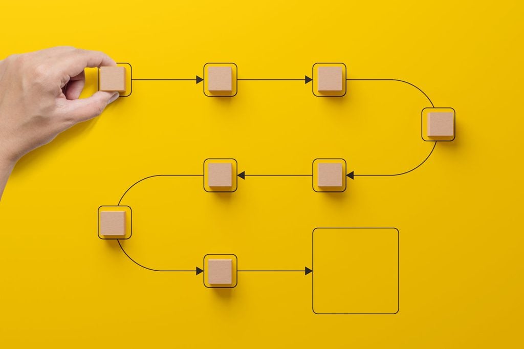
Let’s get something out of the way: “user journey” and “customer journey” aren’t interchangeable buzzwords you can toss around to sound smart in meeti

HTML is one of the foundational building blocks of the Web. But just as web design best practices and techniques change over time, so does the code we

Parallax creates an illusion of depth when scrolling, a timeless effect that still has lots of value in the web design world.Sure, parallax has its is

In the world of advanced UX strategy, few industries demonstrate the power of persuasive (and often problematic) design better than the airline indust
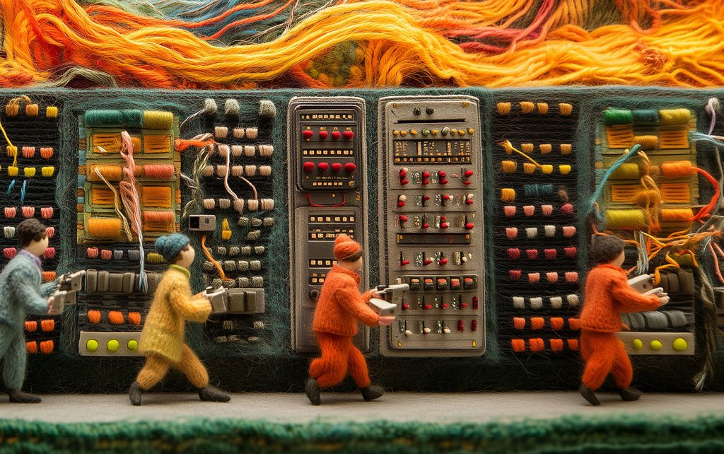
Technology is speeding ahead at a breakneck pace, but have we lost something important along the way?In a beautifully designed and thought-provoking p

Over the last four years I’ve been designing dashboards and applications, and I’ve learned how to deal with different departments, and utilise their k
We are a dynamic information platform dedicated to delivering timely, relevant, and reliable content across a broad spectrum of topics. From the latest in technology and business to lifestyle, health, and global affairs, we aim to keep our readers informed and inspired.
Our editorial team is committed to maintaining high standards of accuracy and clarity, ensuring that every article provides value and context in an ever-changing world. We believe in the importance of accessible knowledge and strive to make complex topics understandable for everyone.
Whether you're here to stay updated on current events, explore thought-provoking features, or simply learn something new, our goal is to offer a trustworthy source of information that meets the needs of a diverse and curious audience.