The freelancer’s guide to outsourcing
When I quit my job 7 years ago to go freelance as a web designer, I thought I was finally free. But what I soon realized was I actually didn’t have ne

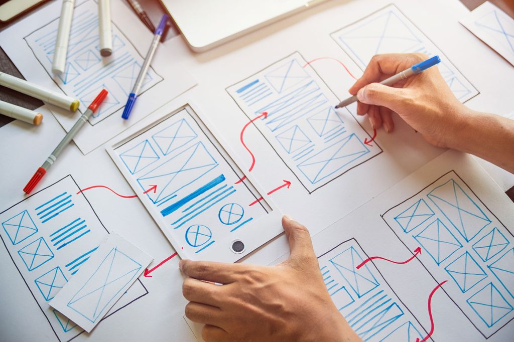
Once upon a time, the sidebar was king. It wore a crown made of navigation links, tag clouds, RSS icons, and if it was feeling especially fancy, a Flash-powered visitor counter.
It was the digital attic of the web—stuffed with everything we thought users might want but didn’t have the heart to throw away.
But in 2025, as design shifts toward ruthless minimalism and mobile-first brutality, we need to ask an uncomfortable question:
Is it time to kill the sidebar—for good?
Sidebars are like appendix organs: maybe they served a purpose once, but most modern websites are just hoping they don’t burst.
Let’s be honest—when was the last time you intentionally used a sidebar? Not glanced at. Not ignored while scrolling. Actually used? For many users, the answer is: never. Most sideline content (pun intended) has become noise. Ads, “related posts,” newsletter pop-ups, social embeds… it’s the bargain bin of UX.
And that’s not just opinion—it’s backed by data. Eye-tracking studies show users focus overwhelmingly on main content areas. In fact, 79% of users never even glance at the right-hand rail on desktop. On mobile? The sidebar is either buried under a hamburger menu graveyard, or simply doesn’t load at all.
So why are we still clinging to it?
A huge reason the sidebar persists is simple inertia. WordPress, Drupal, Joomla—these platforms were architected around templates that made the sidebar a default feature. Designers just kept using them because they were there.
Worse, entire plugin ecosystems were built assuming the sidebar would exist. Ad widgets, category trees, recent comments—all depend on that sacred div with id="sidebar" to function.
Killing it would mean… doing actual layout work. Rebuilding templates. Rethinking hierarchy. So instead, we keep stuffing it with things that belong elsewhere—or nowhere.
But “that’s how we’ve always done it” is not a design strategy. It’s an excuse.
Design today isn’t built around modular zones. It’s built around flows. Scrolls. Loops. Carousels. Feeds.
The sidebar, by contrast, is static and segregated. It’s not part of the primary narrative or user path—it’s a hope. A hope that maybe, after someone reads your longform article, they’ll suddenly have the curiosity and stamina to explore your 19-category archive from 2011.
Mobile browsing has also obliterated the idea that “more visible = more usable.” On phones, everything is hidden behind taps. So a sidebar becomes just another collapsed menu item. If the mobile experience doesn’t need a sidebar to function, why are we maintaining two versions of reality?
Let’s pause. Because here’s the best argument for sidebars: contextual relevance.
When well-executed (and that’s a big “if”), a sidebar can offer editorial value. A running glossary on a dense research article. A persistent shopping cart during ecommerce browsing. A progress indicator for a long tutorial.
In these cases, the sidebar isn’t “extra”—it’s supporting infrastructure. But that’s not how most websites use them. Instead, we get “Follow us on Facebook,” even though the user’s already on your site. Or worse, auto-playing videos of questionable design conference clips.
The sidebar isn’t dead. It’s just been grossly misused.
The best designers in 2025 are rethinking the whole idea of secondary content.
These tactics feel native to the scroll-first, swipe-hungry interfaces of today. The sidebar feels like a leftover snack from 2009.
Here’s a dirty secret: sidebars often break accessibility.
They’re either skipped entirely by screen readers or announced in confusing ways (“Region: Sidebar 1 of 2”). Worse, they can mess up tab order, introduce redundant landmarks, and bloat the DOM. Designers aren’t testing them across modes—they’re styling them for desktop and praying.
Responsive design has only amplified the problem. On wide screens, sidebars are forgotten. On narrow ones, they’re hidden. In both cases, they add complexity without adding value.
Ask yourself this: is your sidebar content critical or decorative? If it’s critical, it shouldn’t be in a sidebar. If it’s decorative, it shouldn’t be there either.
Let’s be clear—we’re not advocating for less content or less user support. We’re advocating for contextual, responsive, and user-first content.
The information formerly known as sidebar content can and should still exist. But it needs to earn its place in the flow, not get grandfathered in via a layout slot.
Designers need to shift from “where can I put this extra thing” to “does this thing belong at all?” And if yes—“how can I present it when it’s most useful?”
That’s a mental model shift. And it’s overdue.
If you’re still unsure, run this checklist:
If you answered “no” more than “yes,” it might be time for a mercy killing.
Or at the very least, a long, honest redesign conversation.
Design is not about legacy. It’s about intention. If a layout element doesn’t serve your users, it’s not nostalgic—it’s wasteful.
Sidebars, like carousels, parallax, or skeuomorphism, had their moment. But they’re not eternal. They’re optional. And increasingly, they’re obsolete.
Maybe it’s time to let the sidebar go. Not out of cruelty—but out of mercy.
And in doing so, maybe we’ll make space for better, leaner, smarter design.

When I quit my job 7 years ago to go freelance as a web designer, I thought I was finally free. But what I soon realized was I actually didn’t have ne

For years, we thought video was the peak of online storytelling—painstakingly edited YouTube explainers, expensive brand commercials, polished Netflix

In recent years, we’ve seen various updates to the web design landscape, such as the arrival of AR and VR solutions for making mixed media. Video cont
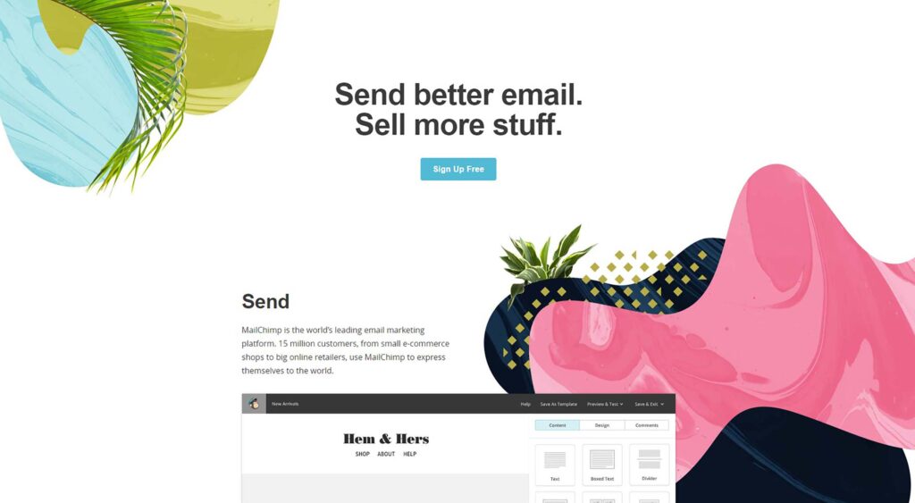
Ok, so you’ve built an awesome digital product—it might be a customer-facing app, an enterprise software, a web app or whatever. You’ve launched and,
Marketing is a waste of time. At least that’s how it feels for many designers. They’re not getting enough traffic, clients or sales. In fact, everythi
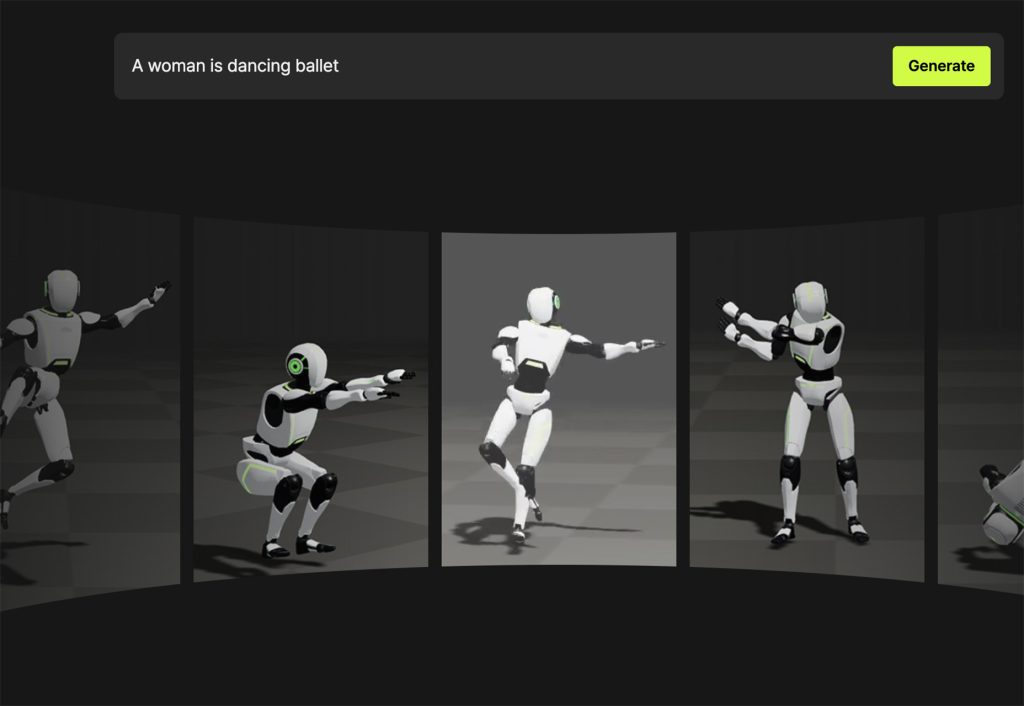
Spring into action this season with new tools to boost your workflows, facilitate creative thinking, and help you be a more efficient designer. This r
We are a dynamic information platform dedicated to delivering timely, relevant, and reliable content across a broad spectrum of topics. From the latest in technology and business to lifestyle, health, and global affairs, we aim to keep our readers informed and inspired.
Our editorial team is committed to maintaining high standards of accuracy and clarity, ensuring that every article provides value and context in an ever-changing world. We believe in the importance of accessible knowledge and strive to make complex topics understandable for everyone.
Whether you're here to stay updated on current events, explore thought-provoking features, or simply learn something new, our goal is to offer a trustworthy source of information that meets the needs of a diverse and curious audience.